When you land on a website, what is the very first thing you notice? This might seem like a simple question, but the answer can completely change how you think about your website.
If your landing page looks messy or confusing, most people will just leave right away, without even bothering to see what you offer.
Even today, with so many easy-to-use tools and templates, a lot of businesses still mess this up. Some cram too much information on the page, while others forget its main purpose.
A good landing page should be simple, clear, and designed to make people take a specific action. That could be signing up for something, buying a product, or just clicking a button. Whatever your goal, the page needs to guide visitors directly to it.
In this post, we have gathered some fantastic landing page examples you can learn from. These pages work. They are clean, smart, and they get results.
Let’s check them out!
What Is A landing Page?
A landing page is a standalone web page that someone “lands” on after clicking a link, usually from an ad, email, or social media post.
Unlike a full website, a landing page is focused on one specific goal, like getting people to sign up, buy something, download a resource, or take any other action.
It does not have lots of links or distractions. Just one clear message and one main purpose.
Good landing pages are designed to turn visitors into leads or customers by keeping things simple, direct, and action-driven.
15+ Top Companies With Outstanding Post-click Landing Page Examples
Ucraft

What This Page Does:
The headline explains that the platform helps you create a website or store quickly.
The text below adds details, like “high-conversion” and “unique” designs.
The buttons (“Get started” and “Talk to Sales”) let users take action.
The free trial offer (14 days) encourages sign-ups.
How To Improve It (A/B Testing Ideas):
Buttons: Try “Start Building Now” or “Create Your Free Site” instead of “Get started.”
Font: Test bolder or larger text for the headline to grab attention.
Free Trial: Make “14-day free trial” stand out more (e.g., bigger or brighter).
Add Trust: Include a line like “Used by 50,000+ businesses” to build confidence.
Zoho

What Does This Page Do?
This page promotes Zoho’s software suite with the headline “Your life’s work, powered by our life’s work,” emphasizing privacy and serving businesses of all sizes. It features a prominent “GET STARTED FOR FREE” call-to-action (CTA) and highlights key apps like CRM, Mail, Creator, Books, and Desk. Red CTA buttons are used for high visibility.
What Could Improve Through A/B Testing?
- Clarity on “Free”: Test more specific details about the free offering.
- Imagery: Experiment with live photos of people instead of illustrations.
- CTA Wording: Try alternative phrases for the “GET STARTED FOR FREE” button.
- Distractions: Evaluate if external links (e.g., social media, T&Cs) hinder conversions.
Hubspot
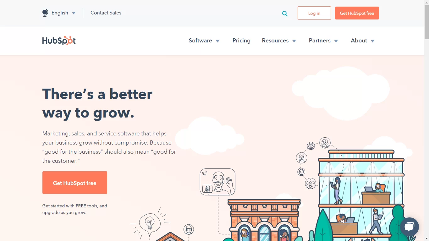
What Does This Page Do?
This page promotes HubSpot as a unified “Customer Platform” designed for “go-to-market teams” to achieve growth. It highlights the platform’s ability to “Unite marketing, sales, and customer service on one AI-powered customer platform that delivers results fast.”
The page prominently offers two calls-to-action (CTAs): “Get a demo” for premium software and “Get started free” for free tools, with a sub-headline clarifying these options.
A new banner announces HubSpot’s integration with ChatGPT for quick answers and insights, linking to a “Learn more” page.
The visual features an illustrative dashboard showcasing contacts, a deal funnel, leads by source, and an AI-powered “Breeze Customer Agent” demonstrating conversational capabilities (e.g., “How do I sign up for your membership program?”).
A persistent chatbot prompt is also visible for assistance. The top navigation provides access to “Products,” “Solutions,” “Pricing,” “Resources,” along with “Customer Support,” “Contact Sales,” and accessibility options like “High Contrast.”
What Could Improve Through A/B Testing?
- Clarity of “Get Started Free” Offering: Testing clearer communication around the specific details or limitations of the “free tools” beyond just the CTA.
- ChatGPT Integration Visibility: Experimenting with the placement, size, or animation of the ChatGPT announcement banner to maximize its visibility and click-through rate, including whether the “Learn more” button or the banner itself is more effective for clicks.
- Illustrative Dashboard Engagement: A/B testing different content within the illustrative dashboard, such as more specific feature callouts or varied user scenarios, to enhance user understanding and resonance.
- AI Chatbot Effectiveness: Optimizing the timing, initial message, or visual design of the bottom-right chatbot pop-up to improve user interaction and lead generation.
- Redundant CTA Placement: Evaluating the impact of having “Get a demo” and “Get started free” CTAs present in both the header and the main body to determine if their duplication adds value or causes unnecessary visual clutter.
MailChimp
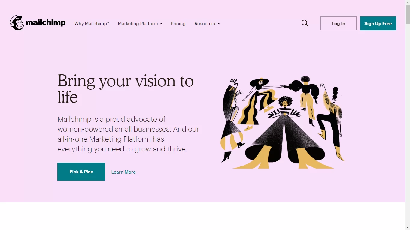
What Does This Page Do?
- The “free” word in the banner section is likely to quickly capture visitors’ interest.
- Easy and Clear Signup page, the image shows it all.
- The 3-field form is short and doesn’t ask highly secured personal information.
- No minimalistic footer or header navigation keeps prospects concentrated on the page’s target – to sign up for a free account.
What Could Improve Through A/B Testing?
- Adding social facts like MailChimp statistics or customer testimonials is more likely to generate more signups.
- The CTA icon is translucent and does not stand out as much as it could. Having this darker and more contrasting will attract more clickers.
- Also, the CTA copy button could be enhanced to include more personalized and appealing words, such as “Create my free account!”
Infusionsoft
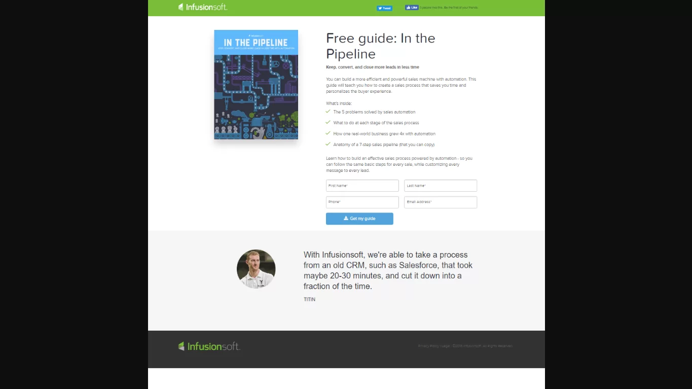
What Does This Page Do?
- Valuable resources are available, and it also uses a “Free” word, which attracts more customers.
- Bullet point copy helps best in converting.
- CTA’s are available in the first person form.
- The picture acts as a representation of the bid, which shows visitors what they will get after they convert.
- A short form makes it easy to convert on this page.
What Could Improve Through A/B Testing?
- Social media links should be added, which helps to keep people engaged on the page and helps to get high conversions.
Midas Media
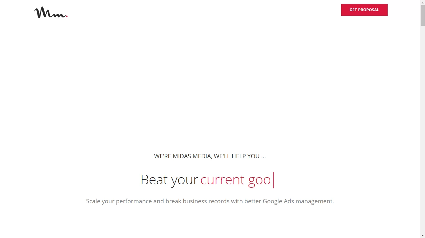
What Does This Page Do?
- The different or odd headline attracts the user’s attention.
- The points available in bullets quickly communicate the benefits of the offer.
- Attractive CTA color.
- The image shows the visitors what they will get after converting into customers.
What Could Improve Through A/B Testing?
- The form fields must get rearranged to add the CTA button in the middle to increase the page’s visual hierarchy.
Pepperdata
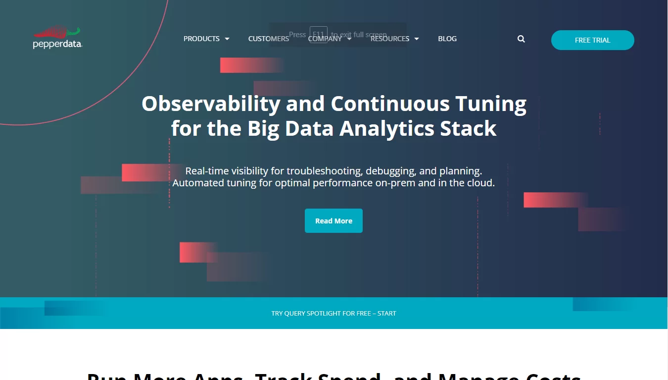
What Does This Page Do?
- The heading of the page displays a clear view of the site.
- The bullet point copy shared the benefits of the services.
- The offers are available in the form of images that attract more customers and help to convert quickly.
What Could Improve Through A/B Testing?
- The CTA button might be personalized and also a little bigger.
- The form is long in consideration that the deal is just one free chapter of the novel.
- The link-filled footer lets prospects escape without converting this page.
Lurn

What Does This Page Do?
- The Top banner line provides beginner-friendly offers.
- The color of the CTA button pops off the screen, attracting attention from prospects.
- The CTA’s are available in the form of the first-party.
- The arrow to direct the prospect’s eyes to the CTA button acts as a visual aid.
- Reviews from top clients affirm the post-click landing page’s persuasiveness.
What Could Improve Through A/B Testing?
- The busy footer offers far too many opportunities for prospects to leave the page.
Sam Ovens
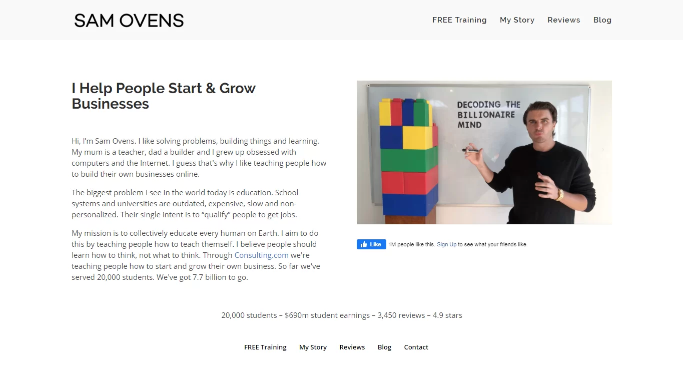
What Does This Page Do?
- The clear benefit seems with the headline of a case study – and analysis of getting clients.
- The CTA button pops on the backdrop of the image.
- Clear CTA’s are available, which attract customers.
- The available CTA’s are available in the First Party form.
What Could Improve Through A/B Testing?
- It seems that autoplay video decreases conversions. If your visitors want to watch your video, then they will press the “play” button.
Eloqua
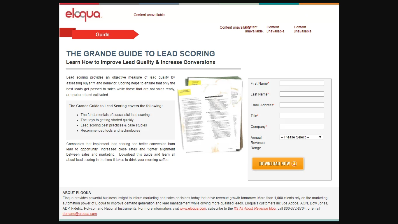
What Does This Page Do?
- Heading describes the offer, and subheading provides a detailed description.
- The bullet points allow us to highlight the important aspects of the information.
- The contrast between the framed and the color around the shape makes it stand out on the screen.
- The orange CTA button contrasts well with the rest of the tab, making it clickable for “pop” and enticing prospects.
What Could Improve Through A/B Testing?
- The content unavailable at the top pages looks unprofessional.
- Make personalized and attractive CTA’s.
- Add essential elements – helps to stand out from the crowd.
- Multiple links are available in the footer, which makes customers more engaged.
Shopify
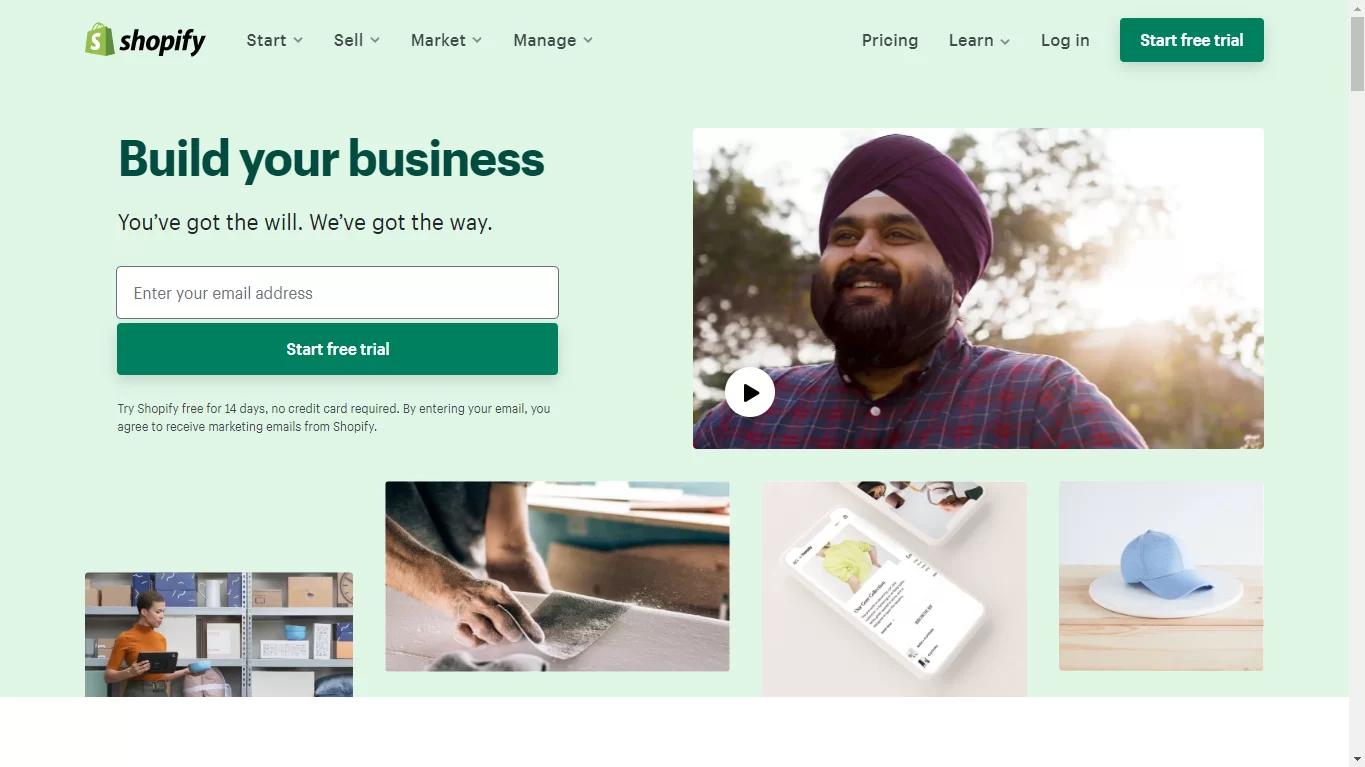
What Does This Page Do?
- The banner contrasts well with the backdrop, helps attract customers easily.
- Only one form of field helps visitors to convert easily.
- Customer reviews and company logos work as social proof, which indicates Shopify is a big-name business and serves highly satisfied clients.
- The available images provide the real user-dashboard view of the Shopify Landing Page.
What Could Improve Through A/B Testing?
- Try changing the CTA button color options.
- People’s eye gaze in the image should point towards the CTA button or form, which would encourage more people to come to their page and convert.
Percolate
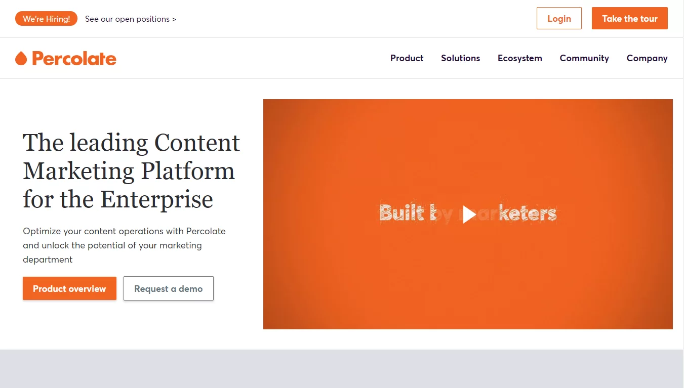
What Does This Page Do?
- The CTA options are available, which offer to know more about the site.
- The color combination of the CTA with the white background contrasts well.
- The amount of content available makes reading this page more accessible.
- Screenshots of the Percolate dashboard are available, which help people to understand its working procedure.
What Could Improve Through A/B Testing?
- Various links available in the header and footer serve as an exit from the main page, which makes customers leave before they convert.
- The heading and subheading show that Percolate is one of the best content marketing platforms.
- The customer reviews available on the site without name and details seem to be inorganic and appear as if the team of Percolate has written them themselves.
Colonial Life
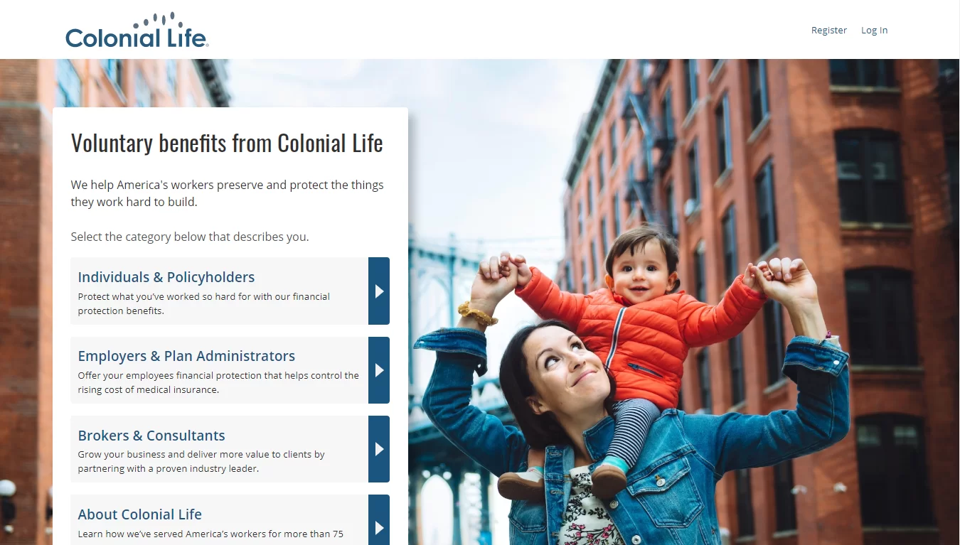
What Does This Page Do?
- The available images show what they will get when they convert.
- The bullet points highlight the important things in the ebook.
- The subheading states that the ebook is free.
- If they want additional information from the sire, people can check or uncheck the box themselves.
What Could Improve Through A/B Testing?
- The CTA buttons available are tiny in size, which is hardly seen by the visitors.
- The available links in the header redirect visitors to either the social media profiles or home pages.
FireEye
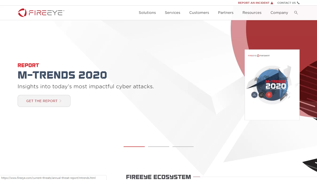
What Does This Page Do?
- The bullet points share the benefits of using the platform.
- The available images help visitors show the things they will achieve after converting.
- CTA color options are quite attractive.
What Could Improve Through A/B Testing?
- The links mentioned in the footer section need to be decreased, as they move the customers away from the page without converting.
Nutanix
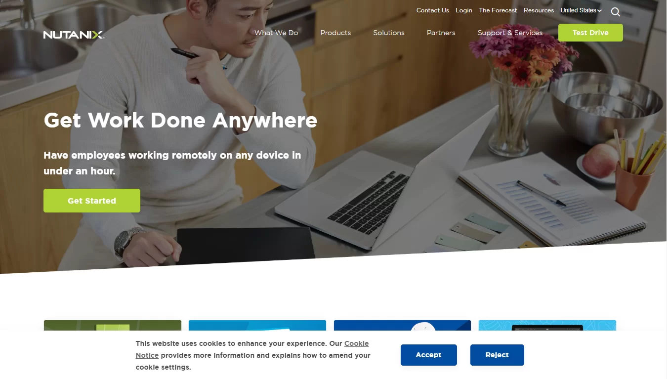
What Does This Page Do?
- Bullet points allow visitors to get an idea of the things they will get in the report.
- The minimum amount of text in the sites allows people to have a quick read easily.
What Could Improve Through A/B Testing?
- A type of 7-field is more likely to intimidate prospects from abandoning the website.
- It has too egocentric a title. It does not communicate any advantages to the tourist at all.
TapClicks
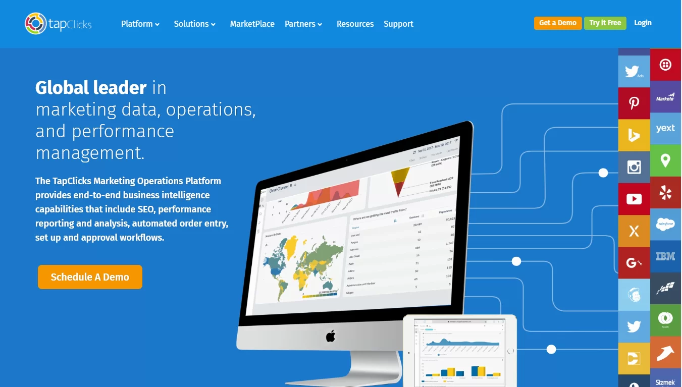
What Does This Page Do?
- In this headline, the word “free” lets people know that the deal does not come at any monetary cost. The same goes for the subheadline for the text “No credit card required.”
- The “Get started in 30 seconds” CTA communicates to the visitor that it is quick and easy to start a trial.
What Could Improve Through A/B Testing?
- A lack of content makes the visitors unlikely to fill in this form.
- The 9-field form may make people leave the page immediately.
- Light-gray type labels can fool visitors as they disappear after each field.
- The CTA color looks similar to the background, which makes it invisible.
Insidesales.com
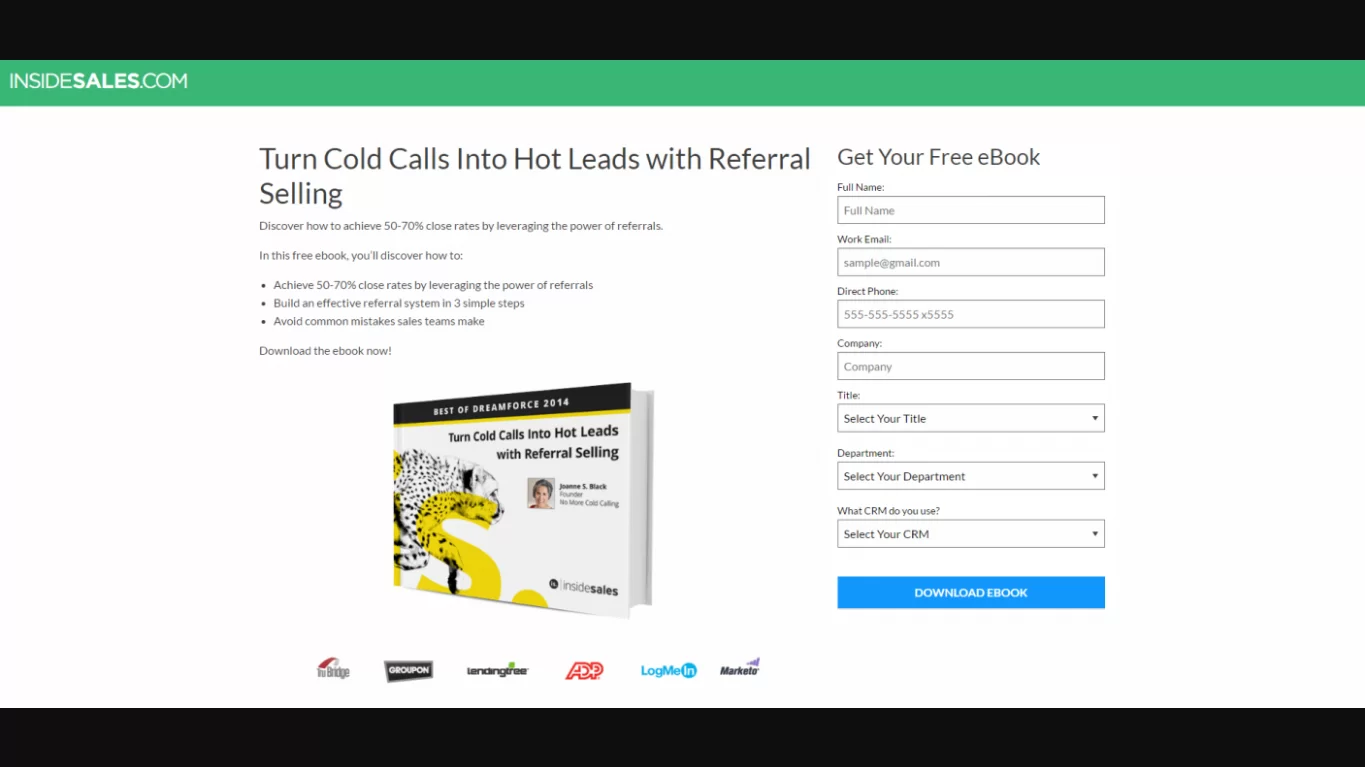
What Does This Page Do?
- The title has a clear advantage on the site.
- Bulleted copy expresses the advantages of a bid easily.
- Big-name company logos enhance credibility by aligning the brand with a few well-known companies.
- The picture acts as a visual representation of the bid, showing visitors what they will be getting after they have converted.
What Could Improve Through A/B Testing?
- The footer with various links to other web pages makes it possible for prospects to exit the website landing page.
- By using a personalized copy, the CTA copy will improve conversion rates.
So, these are some of the trending landing page examples in the market today. Can you beat the best post-click landing page examples mentioned above? Did you make any of the mistakes the brands above did? How do your post-click landing pages look in comparison?
Are all these questions arising in your mind too? Thinking about,
Read More
How To Create Facebook Messenger Ads: In 9 Simple Steps
04 Excellent Tips For Creating Facebook Ads That Convert
11 Reasons Why Mobile Advertising is Better than Internet Advertising
How to create a landing page that stands out amongst all your competitors?
To all these questions, I have a solution, and that is – PowerAdSpy.
PowerAdSpy is a robust catalog of social media ads, which provides an outstanding solution to Advertisers, Ad Agencies, Media Buyers, etc., and helps to keep an eye on competitors’ advertising copies. Not only media ads, but PowerAdSpy also allows you to check the landing pages of your competitors. It offers an opportunity to select the type of format you want to use. It allows you to keep an eye on the competitors’ landing page and avoid the mistakes that are done by they make.
Not only this, but PowerAdSpy also helps to filter by ad positions, gain complete visibility of competitors, narrow down your searches, bookmark the best ads, etc.
Want To See How To Check Landing Page Examples Using PowerAdSpy?
Let’s Begin –
Sign up or log in https://app.poweradspy.com/amember/member using your email ID and security password.
It will lead you to the main dashboard of PowerAdspy.

From here, you can add the required Lander properties along with the search mode and filter mode options.

To check the lander page, click on any ad displayed.
Click on the Show Analytics option, and this will lead you to the ad analytics page.
Conclusion
So, there you have it, 15+ best landing page examples along with all-in-one ad intelligence tools that help you to keep an eye on your competitors and avoid the mistakes committed by them. You can also use tools like PowerAdSpy to be updated with new trends on different platforms like Instagram, Twitter, and many more. You can get Facebook Messenger ads to learn about your audiences.
Don’t forget to share your views in the comments section below, and try considering the things you have learned to create high-converting landing pages.