

The export lands in your downloads folder as campaign_report_final_v3.csv: 4,000 rows, 38 columns, ad set names that made sense to whoever built them in March. The client call is Thursday. The client, a founder who runs a skincare brand, does not care about CPM by placement. She wants to know whether the money is working and what you plan to do next month.
Most media buyers I know are very good at the first part of the job (running campaigns, reading the numbers, spotting a creative that is fatiguing) and much less fond of the second part, which is explaining all of it in twelve slides to someone who does not live in Ads Manager. Choosing what to leave out takes most of the effort.
My monthly client reviews follow the same nine steps across paid social, search and display, whether the slides get built by hand or start as a rough draft from a presentation generator that you then edit.
Step 1: Decide the one question the deck answers
Before opening the spreadsheet, write a single sentence at the top of a blank doc: what does the client need to decide or understand after this meeting? Some examples:
- “Should we move budget from prospecting to retargeting for November?”
- “Is the new UGC creative worth scaling?”
- “Why did CPA rise in September, and is it fixable?”
Every slide you build afterward either helps answer that question or goes into the appendix. This one habit cuts most decks by a third.
Step 2: Pull only the metrics that connect to money
Clients think in revenue, leads and cost. Platforms report in impressions, CTR, CPM, frequency and a dozen attribution windows. Your job is translation.
A useful split:
| Metric tier | Examples | Where it goes |
|---|---|---|
| Business outcomes | Revenue, purchases, leads, ROAS, CPA, cost per qualified lead | Main slides |
| Diagnostic metrics | CTR, CPC, conversion rate, CPM, frequency | Main slides only when they explain a change in outcomes |
| Platform detail | Placement breakdowns, hourly data, device splits | Appendix, or not at all |
If CPA went up because CPMs spiked during a seasonal auction, CPM earns a slide. If CPM was flat, it does not need to appear.
Be careful with attribution windows and source of truth. If the client’s Shopify revenue and the ad platform’s reported revenue disagree (they almost always do), say which one you are using and why, once, early in the deck. Switching between them mid-presentation destroys trust faster than a bad month.
Step 3: Clean and summarise before you design anything
Pivot the raw export into a small summary table. For a typical monthly review, I end up with something like this:
| August | September | Change | |
|---|---|---|---|
| Spend | 100% (baseline) | +12% | Budget increase approved in Aug |
| Purchases | baseline | +4% | |
| CPA | baseline | +8% | Driven by prospecting |
| ROAS (platform) | baseline | -6% | |
| Top creative CTR | baseline | -22% | Fatigue, 5 weeks live |
(Swap in real figures, of course. I have used relative changes here because the shape of the table matters more than the numbers.)
Then add two or three lines of plain-English notes under it. These notes become the skeleton of your deck. For the table above, the notes might read: “Spend up, purchases barely moved. CPA rise is mostly prospecting. Main creative is wearing out. New UGC test in the last week looks promising but has low volume.”
Step 4: Bring in competitive context, sparingly
This is where ad intelligence work earns its place in a client meeting. Showing the client what competitors are running gives them context their own numbers cannot: why the auction got pricier, which offers rivals are pushing, whether a competitor just launched a big video push in the same audience.
Keep it to one or two slides. Good formats:
- A grid of four to six competitor ads currently running, with a one-line note on each (offer, format, how long it has been live).
- A short “what we noticed” slide: “Three of the five competitors switched to bundle offers in September. Two are heavily testing creator-style video.”
- A link between their activity and your plan: “We’re testing a bundle offer in week 2 of November in response.”
Ads that have been running for a long time are usually ones the advertiser is happy with, so longevity is a decent rough proxy for what is working in that market. Say “likely” rather than “proven” when you present it, because you cannot see their results.
Step 5: Draft the structure, then generate the first version
Now you have a question, a summary table, a few notes and some competitor observations. That is enough to draft the deck. I find it faster to write the slide titles first, as full sentences, and then fill in.
A sample outline for the skincare client:
- September in one line: spend up 12%, purchases up 4%, CPA rising
- Where the CPA increase came from (prospecting, not retargeting)
- Why: top creative is fatigued after five weeks
- The UGC test: early signal, still small sample
- What competitors are running (grid of 6 ads)
- What we recommend for November (three changes)
- Budget proposal and expected range of outcomes
- Decision needed today
- Appendix: full metrics table, placement detail
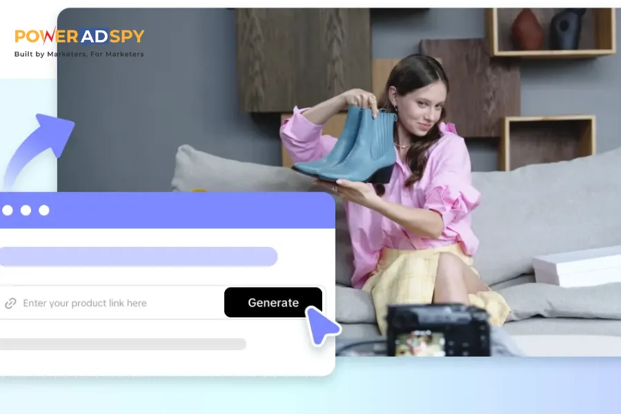
At this stage, an AI slide tool can do the tedious part. Paste the outline and your notes in, ask for nine slides with short bullet points, and you get a laid-out first version to edit instead of a blank template. A prompt along these lines works:
“Create a 9-slide monthly ad performance review for a skincare brand founder. Non-technical audience, 20-minute call. Use these slide titles exactly and the notes below for content. Maximum 3 bullets per slide. Slide 5 should be a placeholder grid for six competitor ad screenshots. Slide 9 is an appendix with a table.”
Then paste your notes and summary table underneath.
What you get back will need work. The value is that the structure, layouts and placeholder content arrive in a couple of minutes, and you spend your time on what only you can do: checking numbers, choosing the right screenshots and sharpening the recommendation.
Step 6: Build charts that answer one thing each
Charts are where ad reports usually go wrong. A line chart with six metrics on two axes looks thorough and communicates nothing.
Rules I stick to:
- One chart, one message, and the slide title states the message.
- Use spend vs outcome over time (two lines, clearly labelled) for the “is the money working” question.
- Use a simple bar chart for comparing creatives or audiences, sorted by the metric that matters.
- Avoid pie charts for budget splits with more than three slices.
- Keep colours consistent across the deck. If prospecting is blue on slide 2, it stays blue on slide 6, otherwise the client spends the meeting decoding legends instead of listening to you.
- Put the date range on every chart. Clients forward slides, and context gets lost.
Most AI tools will place a chart placeholder or a basic chart. For anything with real data, I build the chart in a spreadsheet and paste it in, which keeps the numbers traceable.
Step 7: Write the recommendation like you mean it
The recommendation slide is the reason the meeting exists. Generic recommendations (“continue optimising creatives,” “test new audiences”) tell the client nothing and make them wonder what they are paying for.
Before: > – Continue to optimise creative performance > – Explore new audience opportunities > – Monitor CPA closely
After: > – Pause the hero video on Nov 1 and shift its budget to the two UGC ads > – Launch a bundle offer test (2 products, 15% off) in week 2, matching what competitors are pushing > – Hold prospecting budget flat until CPA is back under target for two consecutive weeks
Each bullet has an action, a timing and a reason. The client can say yes or no to each one.
Step 8: Prepare for the questions you can predict
Every client asks some version of the same four or five questions, and having answers ready (or a hidden backup slide for each) makes the call calmer. For e-commerce clients, these come up most months:
- “Why doesn’t your revenue number match Shopify?” Have a one-sentence answer about attribution windows and modelled conversions, and know the gap for this month.
- “What happens if we cut the budget by 20%?” Know roughly which campaigns would lose spend first and what you would expect to happen to volume.
- “Are we spending too much on people who would have bought anyway?” This is the retargeting question. If you have run any holdout or incrementality test, bring the result. If not, say so plainly and suggest one.
- “What is the competition doing?” Your competitor slide covers this, but keep two or three extra screenshots in the appendix in case the conversation goes deeper.
A backup slide can be rough. It just needs the number and a sentence, because you will only show it if asked, and the client will be looking at it for thirty seconds while you talk through it, which is a very different job from a main slide that has to stand on its own when forwarded to a co-founder who missed the meeting.
Some of these questions have no clean answer. Attribution, in particular, rarely resolves neatly.
Step 9: Read it the way the client will
Before sending, go through the deck as if you were the founder seeing it on a phone between meetings. Check:
- Does slide 1 tell her the headline without needing the rest?
- Is there any acronym she might not know? Spell out ROAS the first time.
- Are numbers consistent across slides (same source, same date range)?
- Does every chart have a title that states a conclusion?
- Is the ask clear?
Then export to PDF for the pre-read and keep the editable version for the call.
Mistakes that make ad reports hard to read
Leading with the platform screenshot. A screenshot of the Ads Manager dashboard is not a slide. Clients cannot read it, and it signals you did not process the data.
Reporting every metric because it exists. Frequency, hook rate, thumb-stop ratio and CPM can all be important. They belong in the deck only when they explain a change in business results.
Hiding bad news on slide 9. If performance dipped, say it on slide 1, give the reason on slide 2, and show the plan by slide 4. Clients forgive a bad month far more readily than a surprise.
Treating the AI draft as finished. Generated text tends toward vague, positive phrasing (“strong engagement across channels”). Replace every vague phrase with a number or delete it.
Making it too long. Ten main slides is plenty for a monthly review. Quarterly reviews can run longer, but use an appendix rather than adding to the main flow.
Making the monthly deck repeatable
Once the first deck is done, save the outline and prompt as a template. Next month you update the summary table, rewrite the notes, swap the competitor screenshots and regenerate. Many agencies build a standard nine-slide structure per client and only change the content. A presentation generator fits this rhythm well because the input (outline plus notes) stays similar while the numbers change, and you can export to PPTX if the client wants an editable file or PDF if they just want to read it.
Keep a running “decisions log” slide at the end of every deck: what was agreed last month and whether it happened. Clients like seeing that what they approved actually got done, and it makes the next conversation shorter.
Quick answers
How long should a monthly ad review take to prepare? With a repeatable template and clean data, a few hours. The first one takes longer.
Should I send the deck before the meeting? Usually yes, as a PDF the day before. People come with better questions.
Is it fine to show competitor ads to a client? Showing publicly running ads for context is standard practice in agency reporting. Present them as observations, and avoid claiming you know how those ads perform.
A last step most people skip
After the call, add one line to your notes on what the client asked about that the deck did not cover. Over three or four months those notes tell you what to add to the template, and the deck slowly turns into something built around the client’s actual concerns instead of the platform’s default report.