
Most CTAs fail because they ask for a click, not a result. If you want to write call action actually converts, shift from “buttons” to “next steps” that promise a clear outcome and reduce effort. Here’s the short answer: define the user’s goal, lead with a strong verb, state the value in plain words, add real urgency (not hype), and test design and placement. In 2026, that simple formula still wins because it respects how people decide.
You’ve likely poured hours into copy and design, only to watch conversions stall. I’ve been there. The sting is real.

You try “Learn more,” swap colors, push a timer, and traffic still drifts away. The fix isn’t louder buttons; it’s sharper intent and less friction. And yes, we’ll get into exact before/after examples you can copy, plus a 5-step method you can run this week.
By the way, your goal isn’t to make users click. Your goal is to help them take the next right step with confidence. That shift changes how you choose words, design the button, and where you place it. It also sets you up to test well. You’ll see why in a minute.
 " showing five steps: user outcome, action verb, value prop, ethical urgency, and placement/design testing; include simple icons, accessible color contrast, and a sample CTA button mockup)
What Makes a Call to Action Work (And Why Most Don't)
A call to action (CTA) is the line or button that tells a user what to do next and why. Good CTAs do three jobs fast: they point to one clear action, they promise a specific gain, and they feel safe to click. Weak CTAs skip one or more of those jobs. That’s why “Click here” underperforms “Get the free template.
The psychology is simple.
- First: Clarity beats clever. People scan for what they get, not what you say.
- Second: Urgency nudges choice, but only when the reason is real.
Clarity, urgency, and friction in practice
A webinar with “Seats close at 200” is clear. A random countdown erodes trust. Third, friction kills momentum. If your CTA implies work, risk, or vague results, users stall.
- Clarity of value: “Start My 7-Day Free Plan” tells me what starts and what it costs.
- Ethical urgency: “Enroll by Friday for the live Q&A” is specific, not manipulative.
- Reduced friction: “No credit card” removes a common blocker in trials.
You asked for data. Here’s how to get it without guesswork. Use ad and landing page data rather than opinions.
For example, CTA-focused ad intelligence lets you sort by CTA phrases across niches and see which survive and scale. With Call to Action sorting, you can scan long-running ads by CTA phrase and performance indicators. You’ll see specific verbs (“Get,” “Download,” “Try”) paired with concrete value tend to rank higher than generic “Click here.” You don’t need to trust me, pull the data for your market and see.

The Three Levers of a High-Intent CTA
- Outcome clarity: State what the user gains in 4–7 words.
- Time cue: Add a real deadline or a “start now” frame when you can fulfill it.
- Safety cue: Reduce risk with a simple promise like “no credit card.
Moreover, design supports psychology. Contrast and size matter. For accessibility and higher tap rates, follow minimum contrast guidance so your button text stands out on its background. See the W3C contrast minimum guidance for the exact standard.
Finally, answer the core question: What makes a CTA work? A clear action + clear value + less friction. Why do most fail? They ask for a click without giving a reason or removing doubt. To write call action actually converts in 2026, fix those three levers first, then test.
Also Read!
How to Plan Holiday Marketing Campaigns That Actually Convert
How to Create Your First Instagram Post That Actually Gets Noticed
A 5-Step Framework to Write Calls to Action That Actually Convert
Here’s the method I use with teams who need wins this quarter, not next year. It’s simple, repeatable, and built to test fast.
Step 1: Start with the user’s desired outcome
Write down the exact job they want done. Not your feature, their result. For example, a founder wants “book more demos,” not “use our CRM.” Your CTA should echo that end state. If you sell templates, the outcome is “Get the template,” not “See pricing.
- Before: “Learn more”
- After: “Get the B2B Proposal Template”
Step 2: Choose a strong action verb
Lead with a verb that matches the task. “Get,” “Download,” “Book,” “Start,” and “See” are workhorses. Match the verb to intent. On a product page, “Start Free Trial” beats “Explore” because the user is closer to action.
- Before: “Click here”
- After: “Start My Free Trial”
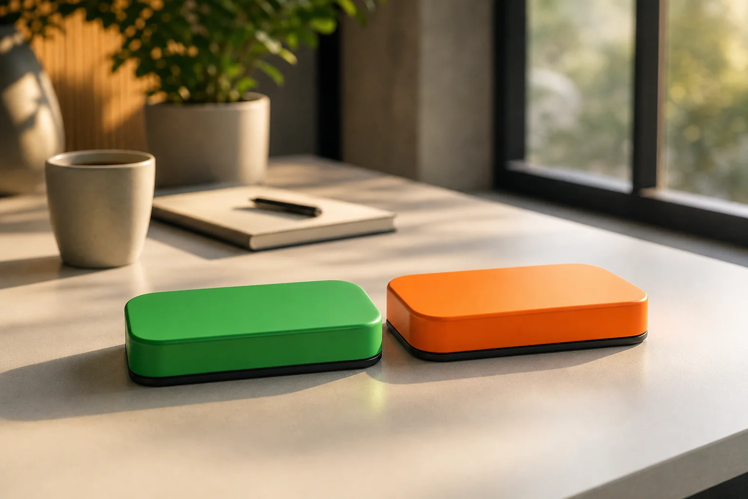
Step 3: Add a simple value proposition
Pair the verb with what they get. Keep it concrete. Three to five words after the verb is enough. Name the deliverable: “guide,” “audit,” “demo,” “template,” or “trial.
- Before: “Sign up”
- After: “Sign Up — 7-Day Free Plan”
Step 4: Create urgency without manipulation
Give a reason to act now that’s true. Deadlines, live cohorts, limited seats, or seasonal runs make sense. Empty countdowns don’t. If there’s no deadline, lean on “today” or “now” to cue momentum without lying.
- Before: “Book a demo”
- After: “Book a Live Demo Today”
Step 5: Test placement and design
Where and how you place a CTA changes clicks. Put a primary CTA above the fold, again after the key proof, and one more at the close. Use accessible contrast and large tap targets for mobile. For mobile design guidance, see Tap targets on web.dev.
- Before: One CTA at the very end
- After: Three CTAs spaced at intro, mid-proof, and close

Example rewrite, end-to-end
- Before: “Click here” under a product blurb
- After: “Get the ROI Calculator — Free”
Therefore, to write call action actually converts, run these five steps on each key page. Then A/B test the verb and the value phrase first. Save color and size for later tests; copy is where the big gains hide.
7 Common Call to Action Mistakes That Kill Your Conversion Rate
You don’t need a full redesign to move the needle. Fix these seven patterns and you’ll see cleaner data in a week.
- Vague language
- Before: “Click here”
- After: “Download the Audit Checklist”
- Too many CTAs on one view
- Before: “Learn more / Try / Contact / Subscribe” all stacked
- After: One primary CTA + one quiet secondary link
- No color contrast or weak size
- Before: Grey text on a grey button
- After: High-contrast button with space and a 16–18px label (meets W3C contrast)
- Ignoring mobile tap targets
- Before: Tiny buttons near other links
- After: 44px+ height and space between actions
- Mismatched intent
- Before: Blog post with “Start Trial” as the only CTA
- After: “Get the PDF Guide” on the blog; save “Start Trial” for product pages
- Fear-based manipulation
- Before: “Buy now or miss out forever!
- After: “Enroll by Friday for the live Q&A” (real deadline, no threats)
- Never testing copy, only colors
- Before: Weeks spent on button shades
- After: A/B test verbs and value first, then refine color and size
Quick Before/After Bank You Can Steal
- “Learn more” → “See Pricing & Plans”
- “Submit” → “Get My Free Quote”
- “Join” → “Join the October Cohort”
- “Register” → “Save My Seat — 11 AM ET”
- “Contact us” → “Request a 15‑Minute Call”
Moreover, spread CTAs across your page based on readiness. Early scrollers get “Save My Seat.” Deep readers get “See the Implementation Plan.” As a result, your funnel meets users where they are instead of forcing one jump.
Finally, to write call action actually converts across devices in 2026, treat mobile as the default. Large tap targets and clear spacing are not nice-to-haves; they are table stakes for clicks that count.
Also Read!
How to Build a Viral Marketing Strategy That Actually Works
How to Create High-Performing Real Estate Ads That Generate Leads
Tools and Resources for Testing Your Calls to Action
You don’t need a massive stack to test CTAs. You need three lanes: copy tests, behavior heatmaps, and market intel on what wins in your niche.

Three Lanes to Test
First, A/B testing. You can run simple split tests on button copy and placement with tools like VWO. Google Optimize existed as a free entry point (now sunset); many teams moved to paid or built-in testing in their analytics packages. Start with the verb and the value line. Those two shifts tend to move conversion more than color.
Second, behavior heatmaps and session replays show where users hesitate. Hotjar can reveal rage-clicks on dead elements, scroll drop-offs before your CTA, or confusion around form steps. Use that data to cut steps or move the button closer to proof.

Third, ad and landing page intelligence. Tools like PowerAdSpy, an ad intelligence platform, let you study which CTA phrases show up in long-running, high-engagement ads across networks.
- Sort by Call to Action to see effective CTAs in various niches.
- Run targeted ad search using domains, advertisers, keywords, or specific CTAs.
- Work with data that includes millions of ads from over 100 countries.
In its user stats, advertisers report a 15% reduction in A/B testing volume under two months of usage, a 19% improvement in user revenue with decreased workforce and increased work efficiency, and 26% saved at least one day preparing for an advertising project. Those gains come from learning faster what to write and where to place it, not guessing. If you want to write call action actually converts and do it at scale in 2026, studying proven CTAs in your market gives you a head start.
Handy Copy Resources
- Verb banks: Build your own set of approved verbs by funnel stage (Explore, Evaluate, Decide).
- Swipe files: Keep a private doc of before/after CTAs and test notes so your team does not repeat old tests.
What to Do Next: Put Your New CTAs to Work This Week
Let’s get this live. Time-box each task so this doesn’t drift.
- Day 1 (45 minutes): Audit five pages. For each page, write the user’s goal, current CTA, and one rewrite using the 5-step method. Include one urgency tweak and one friction reducer.
- Day 2 (60 minutes): Pick three pages to ship. Add three placements per page: top, mid-proof, close. Ensure contrast and mobile tap target size meet standards.
- Day 3 (40 minutes): Set one A/B test per page on the verb or value phrase. Keep the rest fixed. Label tests so you can learn later.
- Day 4 (30 minutes): Review heatmaps to check if users see and reach your buttons on mobile and desktop.
- Day 5 (45 minutes): Scan market CTAs. Use CTA sorting and targeted searches to log 10 high-performing phrases in your niche. Queue two for next week’s tests.
Therefore, by Friday, you’ll have live CTAs, a test plan, and a small bank of market-proven phrases. That’s enough momentum to start compounding wins.

Key Takeaways
- Clear action + clear value + less friction beats “Click here.
- Use the 5-step method: outcome, verb, value, urgency, and design/placement.
- Test copy first. Verbs and value lines move conversions more than color tweaks.
- Space CTAs by readiness: above fold, after proof, and at the close.
- Use market data and ad intelligence to find proven CTA phrases in your niche.
What to Do This Week: Pick three key pages, ship a single strong CTA rewrite on each, and run one A/B test on the verb or value line. Meanwhile, gather 10 proven phrases from your market so next week’s tests start with an edge. To write call action actually converts in 2026 and beyond, keep your words honest, your proof close, and your tests tight.