8 Facebook Ad Examples That Work Best
Facebook has become one of the most widely used social media platforms of today’s living population. The total user base of Facebook is expected to reach 1.69 billion users in 2020, up from just 1.34 million in 2014. With its such a vast popularity, the advertisement comes as a natural phenomenon occurring in this social media platform. Brands are getting aware of the vast potential this platform offers to promote their products at such a wide scale. An estimated 67% of social advertisers find Facebook the most effective ad platform, with this number rapidly growing each year, evident from the many Facebook ad examples.
Facebook earned over $4 billion from ads this year, proving their effectiveness. To market your brand, you should also leverage this successful platform.
Listen To The Podcast Now!
How To Build A Succesful Ad Strategy On Facebook?
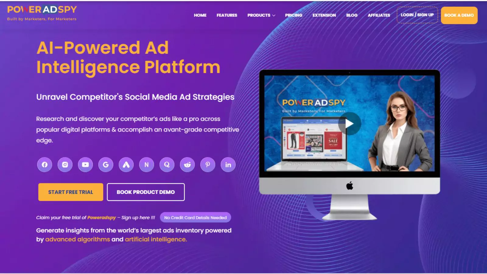
To build a successful Facebook ad strategy, study the approach of top-performing ads on the platform. PowerAdSpy is an effective tool for this. It displays top Facebook ads based on your search criteria like demographics and locations.
You can get a list of examples of good Facebook ads on a generic level by a simple Google search. But if you want to study thoroughly the specific winning ads by your competitors in your sector, then PowerAdSpy is the tool you might be looking for.
In this blog, we have compiled a list of some of the best Facebook ad examples, including Facebook ad campaign examples that have delivered strong engagement and conversions. You’ll also find insights on what makes a particular Facebook ad example stand out in terms of design, messaging, and targeting.
Let’s look at them sequentially.
1) CoSchedule’s To The Point Advertisement.
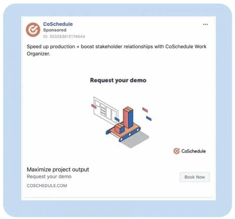
CoSchedule is a company that builds project management software. If you notice the ad strategy behind this, you will find that they have kept it extremely simple. It is also easy to understand, and quite specific to the purpose it serves. Some key-points worth noticing are:
Catchy Graphics:
The graphics they have used in their Facebook ad examples arise curiosity in a viewer. They’ve made it clear that it shows input going into a machine and output coming out.
Just through this simple image, they have made the connection with their viewers, which in turn would urge them to know more about the product.
Beneficial Phrase:
The phrase used at the bottom as “Maximize Project Output” hits the right key in a reader’s mind in that it brings the element of specific purpose what they might be looking for.
This would leave a prospective customer with a curiosity to know more about how they can maximize their project output and hence would eventually lead them towards understanding more about the product.
Direction For The Next Steps:
One of the reasons this ad stands out among all other ads merely is because it is complete in itself. It doesn’t let the prospective customer wander anywhere else after seeing the ad but calls for action by showing them the option to “request your demo”. It is highly likely after they have requested the demo that they know about the product and would buy it.
2) Quickbooks At A Lesser Price
Quickbooks is an accounts related software specially made for small-scale businesses and self-employed individuals. What appeals to most of the viewers of this ad are:
Carousel Ad Format:
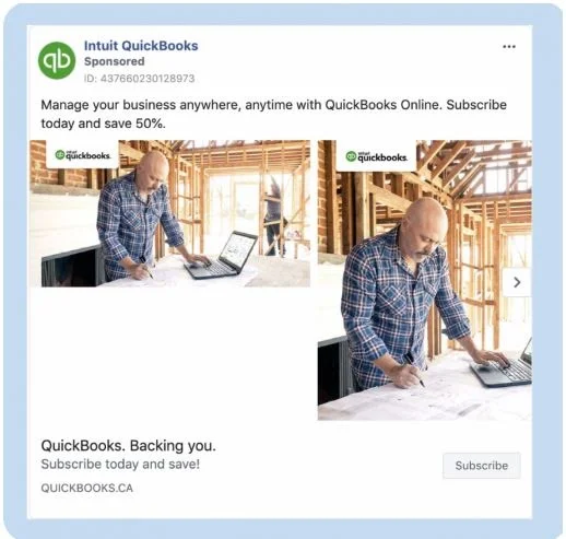
The way the creative has been used in their Facebook ad examples, a small image right before a large image is called a carousel ad format on Facebook. This format is especially useful to stand out among the usual rut of ads that are usually created and bring the element of freshness among the viewers.
Heavy Discount:
Anyone who is on the verge of buying this software would surely do so by seeing the 50% discount being clearly mentioned on this ad. Buying the software for half a price is surely a deal one wouldn’t want to miss if the software has passed the other benefits’ criteria of the user.
Seamless Mobility:
This feature, though listed in the last but not the least, surely talks about the most crucial benefit a user will get out of this software. Seamless mobility is one of the attractive features mentioned right at the beginning of the ad that catches the eye of a customer.
3) MVMT Biggest Sale Advertisement
MVMT is one of the US-based watch company that grew its market solely with the help of social media. Few essentials worth noticing about this ad are:
Hi-resolution Image:
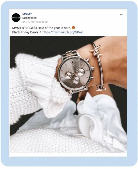
In the world of digital gadgets, watches have lost their purpose and have only retained the use of a status symbol. This ad has aptly captured this sentiment hence has created a strategy purely based on the fashion symbol it represents. The hi-resolution image without a single text appearing on it attracts the beauty of this product, which is hard to resist by its viewers.
Ad Placement:
The product has gained its prominence by being placed right at the center of the ad. The whole picture of the watch speaks for itself, and there have been no wordy features added into the ad, which is hard to resist for an advertiser. The common mistake most of the product-based advertisers do is to overload the ad with all the features and this is where a luxury item like this one loses its attraction among the viewers.
MVMT has made it a point for all its products to use fewer words and more visuals that have worked a great deal for them in their Facebook ad examples.
Minimal Wordings:
The only words used in this ad are for mentioning about the most significant sale they are running along with a direct link to buy their product. With such a simple advertisement strategy, they have hit the nail on the head.
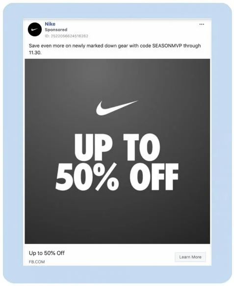
4) Nike’s Precise Ad Campaign
Even the big brands like Nike are resorting to the Facebook ads for getting more traction of their customer base. Their name is already hugely recognized, so they have cut to the chase by this simple ad strategy. Few points worth having a look are:
Reinforcing The Main-Point:
They know that customers would be attracted more if they discover the discount that Nike is offering in this ad. Hence, to strengthen their offering, they have mentioned the 50% discount in two places in this small ad, which is different than usual.
Simplicity:
Since Nike is one of the biggest brands in its league, viewers are already aware of the name of it. Hence, they need not advertise the quality and other features of the brand. They just want to highlight their offer, and this has been done with the exact placement of their ad.
Introducing The Discount-Code:
Simply giving the discount will not pull as much user-engagement as it will when issued through a discount code. It arises more curiosity factors among the users and gives them a chance to avail the offer in a more engaging manner.
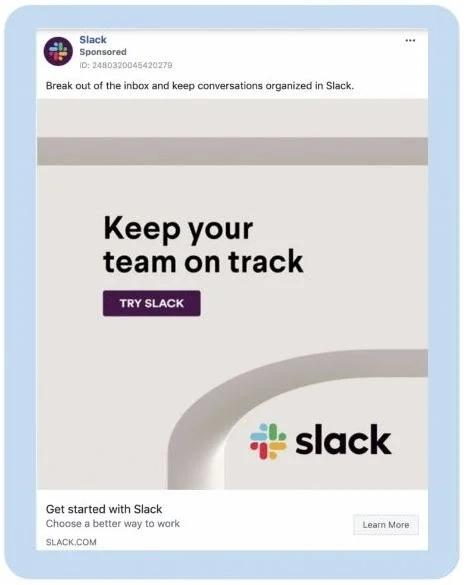
5) Slack Software For Organizing Your Team
Slack is a communication software specially designed to organize your emails and other communication with your team seamlessly. In this ad they have directly hit the objective being served by this software and that’s why grabs attention of its viewers. This ad has some specific strategies placed in a very subtle manner which are:
The Color Combination:
With Slack’s multi-colored logo, they needed light and soothing background so that it comes out distinctly to the first-timers. The light blue thick border and light gray inner background do exactly in that they highlight the name and logo of the company. The logo also speaks to those who have previously made an association in their memories through its colors.
Straight To The Point One-Liner:
“Break out of the inbox and keep conversations organized in Slack” clearly defines the purpose of this software in just one line. It avoids any confusion and helps connect with those who are already suffering from the complexity of communication at their workplace. Hence, this line hits the nerve and offers the solution at the same time.
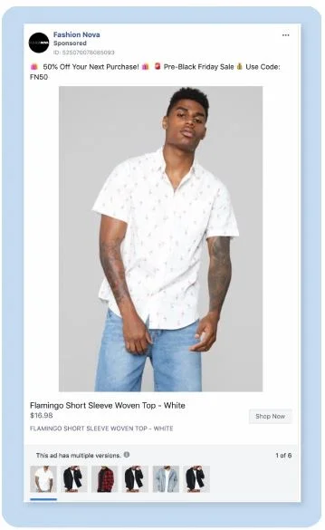
6) Fashion Nova Product-Based Ad
Fashion Nova is a company for fashion clothing. It originally began producing fashion clothing for Afro American plus size women but eventually expanded to cater to men’s section as well following their immense success. What made this ad famous on Facebook are:
Clear Picture Showcasing The Product:
The foremost rule for any advertisement of a fashion product is the clear look of the product. They have made it even easier for the viewers by creating multiple versions of their products in different pictures. This gives a user a visual delight of the product with varied options to try for.
Using All Hooks In One Line:
It is worth noticing that they have used three different ways to showcase their sale – by using the coupon code, discount percentage, and the discount day. This hits the viewers many times than usual about the massive discount they are offering and would make it harder for them to miss this opportunity.
7) Porsche’s Stylish Ad
Who hasn’t heard of the name Porsche? It is one of the biggest names in the world of luxury cars, and their car ads reflect the brand’s prestigious image. This ad has been made by them to promote their magazine called Type 7.
Catchy Colors:
What stands out in this ad the most is the color combination they have used to grab the attention of the viewers. With so much appealing color combination, there would not be a single viewer who wouldn’t stop scrolling their Facebook wall to check out what this ad is all about.
Emotional Connect:
Porsche already has a brand value in the world. They know that it is not needed for them to make people aware of their brand. All they need is to invoke the right emotion in their viewers and associate the product they are promoting with it. Hence, the use of the line “Do you love the outstanding” associates the brand’s value with the new product, which is a magazine they have launched.
Also, Check Out Our Related Articles –
How to Find and Research Facebook Ads of Your Competitors?
9 Tips to Write the Best Facebook Ads Ever
Facebook Business Suite: A Complete Guide
04 Excellent Tips For Creating Facebook Ads That Convert
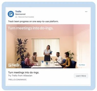
8) Trello’s Easy-Going Meetings Ad
Trello is again a project management software (like the one listed above), which is used to bring efficiency into meetings. They have mobile as well as desktop versions of the app available in the online market. What makes this ad appear in the best performing list are:
Catchy Line:
It has been specifically made to address the most common issue faced by corporate employees in their meetings. This is about holding too many meetings, which obstructs the flow of work and prevents it from moving forward. “Turn meetings into do-ings” hits precisely at the right spot for people suffering from the above-stated situations. Hence, people can easily relate to it.
The Similar Color Used:
This background color is in alignment with other ad campaigns that Trello is running on the online platform. Due to the same color combination used again, people can easily associate the colors with the brand name. Hence, a cumulative ad strategy is in place by Trello, which becomes visible only when we examine all its ads at one time.
As thousands of new Facebook ad examples emerge daily, the list of top-performing ads remains fluid. Moreover, as marketers become increasingly aware of diverse ad strategies, and with the proliferation of articles like this one, fresh ads continually ascend to the pinnacle of success.
PowerAdSpy- Facebook Ad Analysis Tool
It is always wise to use an ad analyzing tool. It will always give you the updated list of best performing ads at just a single click. Hence, Poweradspy is a dynamic ad analyzing tool designed just for that. It will prevent you from repeating the same mistakes. Which other marketers have already made by analyzing various Facebook ad examples.
With this software, you can always get a list of best performing ads at any location in the world. You can make a search on the millions of ads that are running on the various social media platforms. And study the top-performing ones listed by this highly intelligent software.
Let’s say you want to see some sample ads for cars. Enter search criteria on PowerAdSpy’s dashboard to view top ads based on your selected sorting option.

