15 Unbeatable Advertising Design Strategies You Need To Try
Imagine scrolling through your feed and pausing at an ad that immediately captures your attention. What made you stop? Was it the striking colors, the bold typography, or the clean, minimalist designs? This is the magic of effective advertising design. It’s not just about looking good- creating visuals that speak directly to your audience, driving engagement, and boosting brand recognition.
But what goes into crafting these attention-grabbing designs? In this blog, we’ll dive into 15 powerful strategies for advertising design that can transform your campaigns and leave a lasting impression on your audience.
Listen To The Podcast Now!
Why Advertising Design Matters?
The role of advertising design is to communicate your brand’s message as engaging and effectively as possible. It blends creativity with functionality, ensuring ads look good and serve their purpose. While you might want to drive clicks on your website, increase brand awareness, or just improve customer conversions, a well-executed advertising design can make all the difference.
Let’s not waste much time and dive into advertising designs!
1. Minimalist Advertising Design
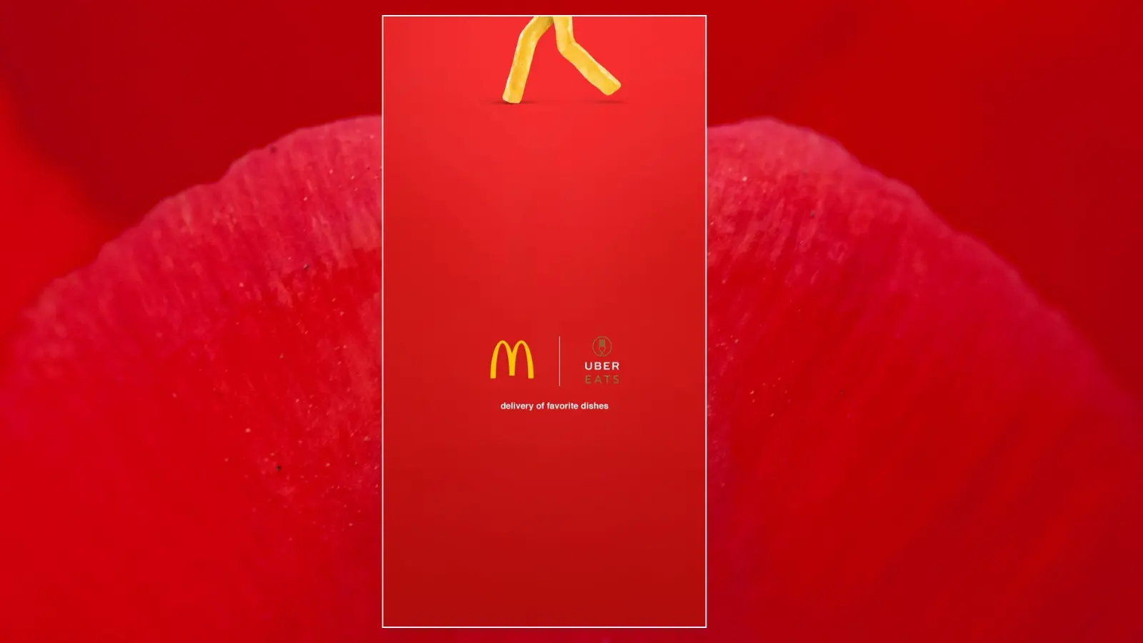
Minimalism isn’t just a trend- it’s a way to declutter your ad and allow the message to stand out. Use a minimalist approach like in McDonald’s advertising design by including only essential elements: a bold headline, striking imagery, and a clear call-to-action. This reduces distractions, helping your audience focus on what matters most.
2. Bold Use Of Colors
Color can evoke emotions, influence behavior, and make your ad memorable. Using bold colors can grab attention, while softer tones evoke calm and trust in graphic design advertising. Choose colors that resonate with your brand identity and connect emotionally with your target audience.
This Sprite ad design perfectly reflects the brand’s bold and vibrant colors, creating a striking visual impact. Want to discover visually appealing design ideas? Spy on your competitors’ ads with PowerAdSpy and uncover their ad strategies.
3. Creative Typography Advertising Design
Fonts are more than just letters; they express your brand’s voice. Whether you opt for a sleek, modern font or something more playful, typography can influence the tone of your ad. For example, this Cadbury ad combines strong fonts with a clean layout that can create a visually appealing balance in advertising and graphic design.
4. Illustrative Advertising Design
Illustrations offer a fun, unique, and creative approach to advertising graphic design. They provide an opportunity to show off brand personality and make your ad stand out from the sea of stock photos.
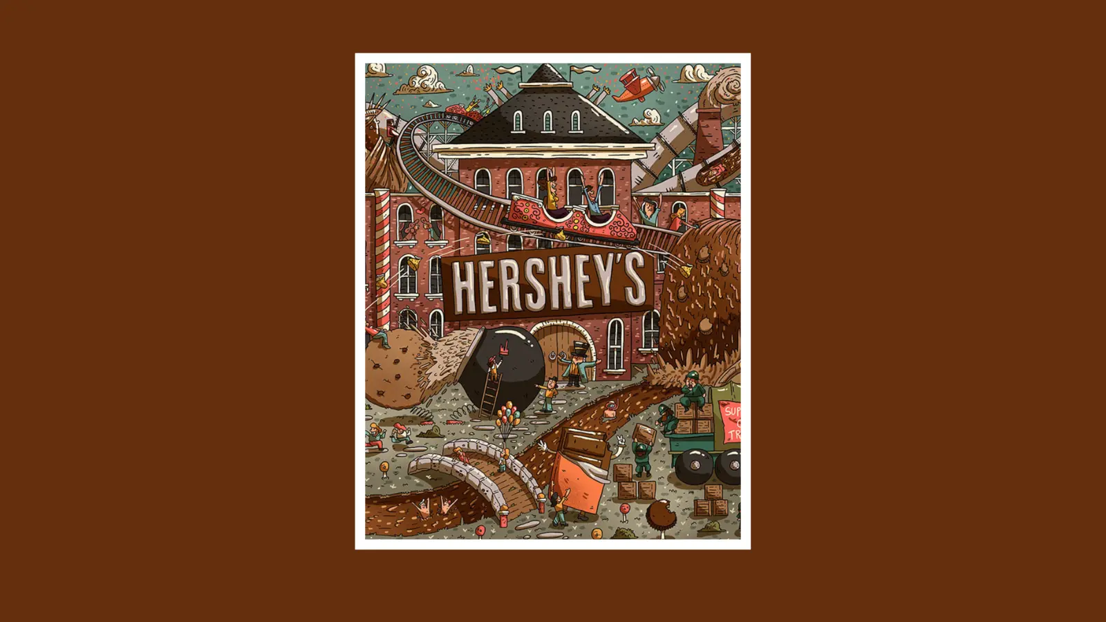
Custom illustrations are a compelling way to convey a brand’s story while maintaining its distinct visual identity, much like Hershey’s ad design. Through creative and thoughtful illustrations, it beautifully captures the essence of the brand, bringing its story to life in a memorable and visually striking way.
5. Geometric Patterns
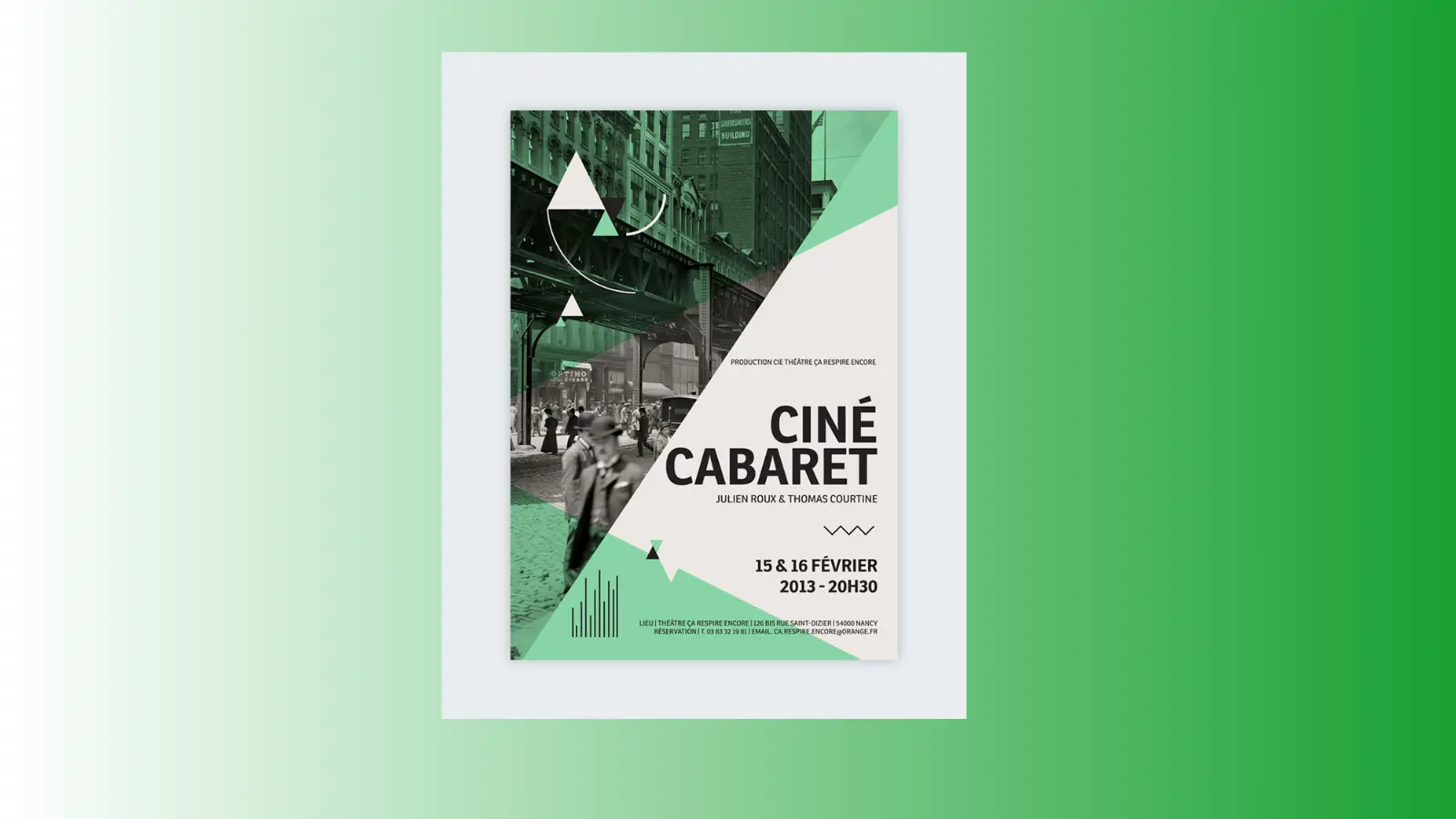
Using geometric patterns in advertising design can make your ad look structured, modern, and professional. These patterns can guide the viewer’s eye to key information, like your call-to-action, or simply add a layer of visual interest without overwhelming the design.
6. Outdoor Advertising Design
Outdoor advertising encompasses formats like billboards, posters, and ads at bus stops, offering a way to engage individuals who may not actively look for your brand online.
Designing for outdoor ads requires careful consideration of location, audience, and messaging, as they need to grab attention from afar. Incorporate vivid colors, eye-catching visuals, and a compelling call to action to make the ad stand out and resonate with viewers.
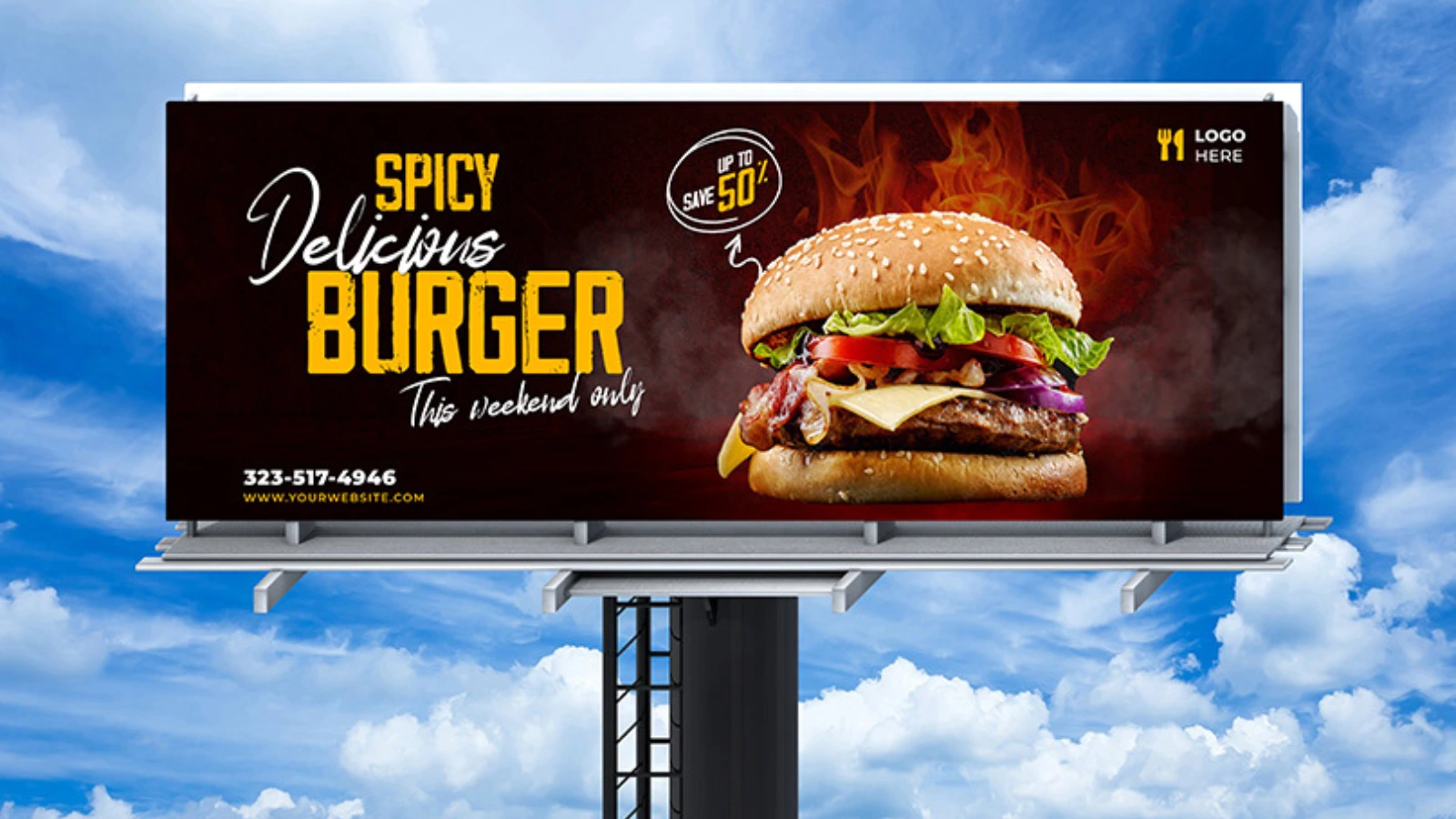
This billboard ad for burgers is a prime example of well-executed outdoor advertising. The way the colors of the sky and clouds blend with the ad creates a seamless and visually appealing backdrop. This balance not only helps the billboard stand out but also boosts its overall effectiveness.
Also Read
Creative Ads Design & How to Create Them
07 Ultimate Tips To Innovate Ads For Your
7. Interactive Design
While interactivity is more common in digital ads, it’s becoming a key trend. Interactive designs engage the audience by allowing them to click, swipe, or explore different elements within the ad. Adding elements of interactivity in ads makes them memorable and often increases conversion rates.
In the CarDekho ad, the ‘Book Now’ button is an interactive feature that easily directs users to the website. It’s crafted to catch attention and simplify the process, motivating people to take instant action. This clear call-to-action helps create a smooth user experience, making it more likely they’ll complete the booking.
8. White Space Mastery
White space, or negative space, refers to empty areas surrounding design elements. Proper use of white space can make your ad more readable and aesthetically pleasing. It gives the design room to breathe and ensures your audience can handle the information.
This beauty poster is a great example of using white space to draw attention to the design and make it more understandable. By grouping related elements and separating them with white space, the design stays clean and simple, making the message clear and easy to follow.
9. Video Ads
Incorporating video into your advertising design adds a dynamic element that static images simply can’t. Short, snappy videos capture attention quickly and convey abundant information in seconds. In an age where scrolling is the norm, videos can help halt the endless scroll and draw attention to your brand.
10. 3D Elements
3D design is growing in popularity due to its depth and realism. Ads that incorporate 3D elements offer a richer, more engaging visual experience. They can make a product look more tangible and create a unique perspective that stands out in a crowded space.
Take this ad, for instance. Notice how the board and flames are designed as 3D elements, which adds depth and makes the visual far more immersive and captivating. This level of detail brings the ad to life, making it not only more realistic but also more engaging for the viewer, drawing their attention instantly.
11. Split-Screen Layout
Split-screen layouts divide your ad into two or more parts, allowing you to showcase different aspects of a product or service simultaneously. This format works well when you want to contrast two ideas or showcase multiple features in a visually appealing way.
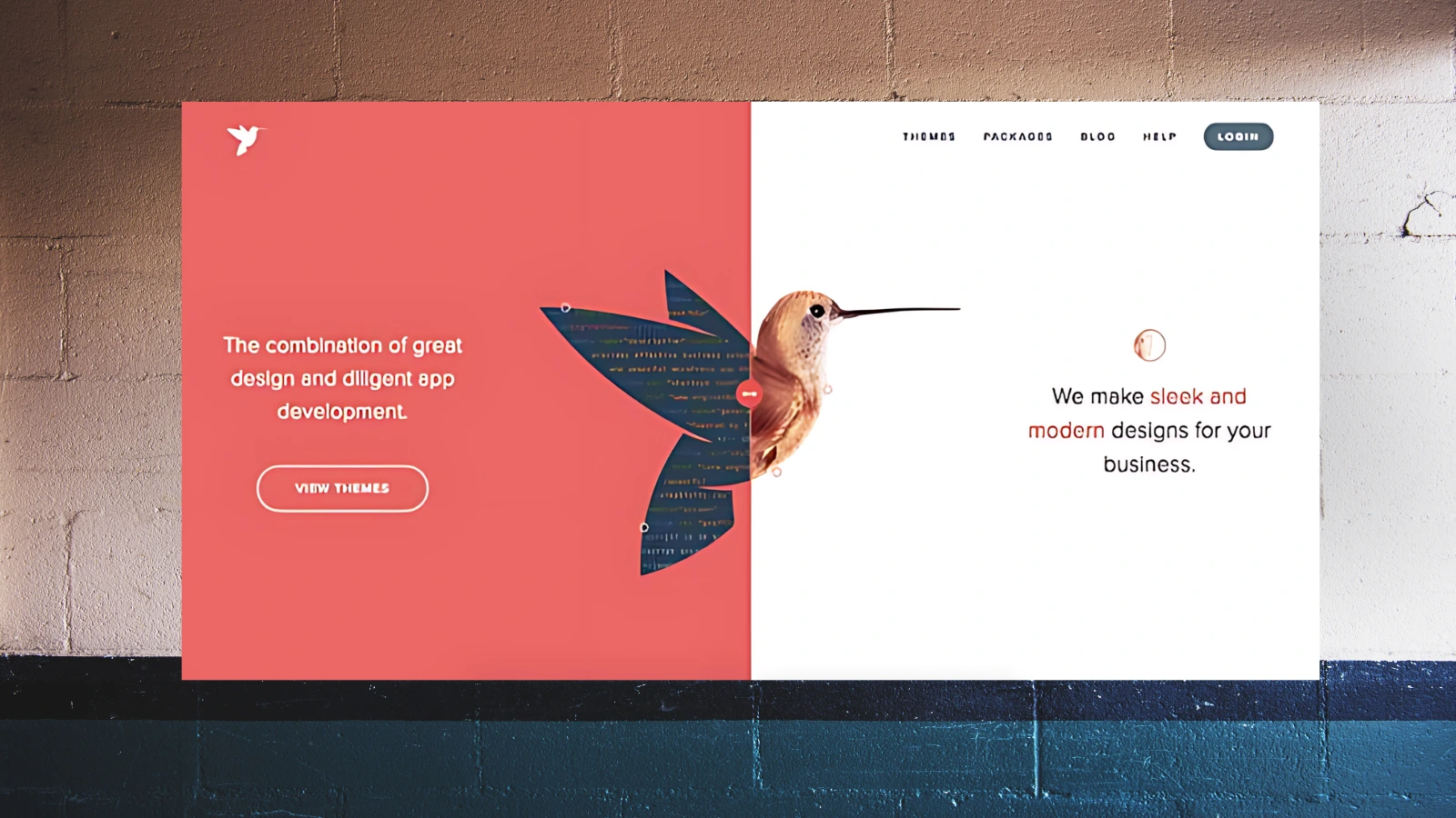
This split-screen layout effectively contrasts two distinct moods and highlights the features being promoted. It presents the information in a visually appealing way, making it easy for the audience to digest the key points by dividing the design.
12. Gradient Color Schemes
Gradients are making a comeback in advertising design. Using gradients can add a modern, vibrant feel to your ad while maintaining visual simplicity. Whether applied to backgrounds or text, gradients give a fresh, contemporary touch to any design.
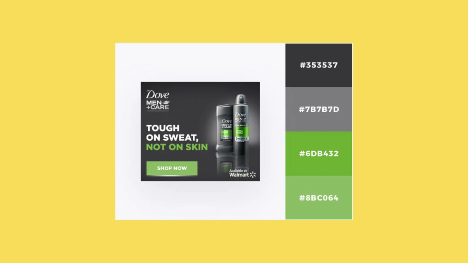
The linear gradient in the image is a smooth transition between two colors: dark gray (#353537) and light gray (#7B7B7D). This gradient is applied to the text “TOUGH ON SWEAT, NOT ON SKIN,” creating a visual effect that suggests depth and dimension. The contrast between the dark and light shades can improve the readability of the text, especially on different backgrounds.
13. Storytelling Through Images
A picture is worth a thousand words- this couldn’t be more true for advertising. Storytelling through imagery allows you to convey complex ideas in a way that resonates emotionally with your audience. Combining storytelling with strong visuals can leave a lasting impression.
For example, this Coca-Cola ad featuring Santa Claus is a great example of storytelling in advertising. The image taps into the cultural iconography of Santa, a figure that symbolizes joy, warmth, and the holiday spirit. The ad evokes nostalgia and happiness, effectively linking these emotions to the brand by associating Coca-Cola with this beloved character.
14. Pamphlet Advertising Design
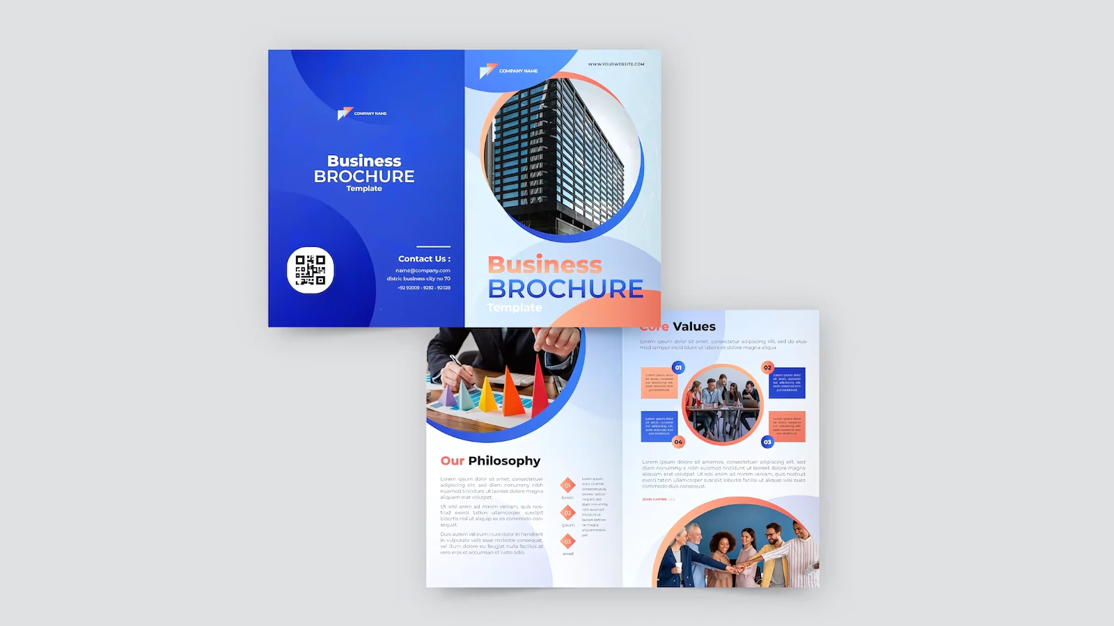
Pamphlets are compact booklets designed to provide valuable insights into a company’s products, services, features, and benefits.
They are particularly beneficial at trade fairs and conferences, where they help businesses communicate details that may be challenging to discuss in person. Additionally, pamphlets serve as physical takeaways, reminding attendees to reconnect with the company after the event, and fostering continued engagement.
15. Photo Booth Advertising Designs
Photo booth ads are promotional materials designed to showcase photo booth services. They typically feature eye-catching visuals, highlight key benefits (like instant prints or customizable props), and include a clear call to action, such as “Book Now” or “Learn More.” The goal is to attract attention, convey the value of the service, and encourage potential customers to take action.
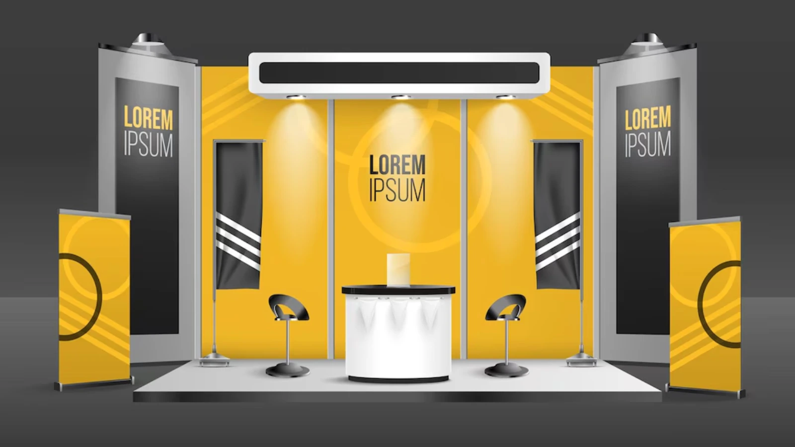
The photo booth advertising design in the ad features a modern and eye-catching display that is perfect for attracting attention at exhibitions or trade shows. Here’s a breakdown of the key elements:
Overall Design:
- Clean and minimalist: The design is clean and uncluttered, with a focus on the main message and branding.
- Modern aesthetic: Bold lines, geometric shapes, and contrasting colors create a modern and contemporary feel.
Color Scheme:
- Primary colors: Yellow and black are the primary colors used in the design, creating a strong visual impact.
- Contrast: The high contrast between the bright yellow and the dark black makes the design stand out.
16. Print Ad Design
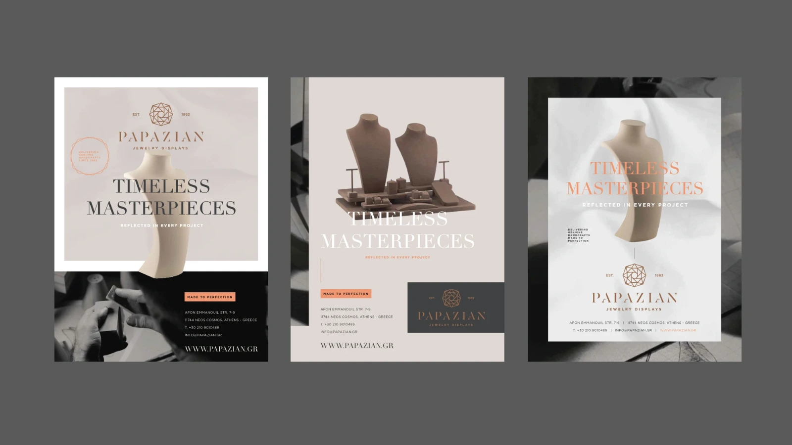
Print ad design creates physical ads, like posters or brochures, using striking visuals, clear messaging, and strong branding. It includes a call to action and contact information to engage readers and prompt them to act.
Consistent Branding: The “Papazian” logo and tagline “Timeless Masterpieces” are prominently displayed in all three ads, reinforcing the brand identity.
Minimalist Aesthetic: The clean, uncluttered design highlights the product and brand message and contributes to a sophisticated and upscale feel.
High-Quality Imagery: The images of the jewelry and the artisan’s hands appear high-resolution and well-composed, adding to the overall visual appeal.
Standing out and getting clicks can be challenging in this crowded digital space.
You need innovative and original ideas to leave a lasting impression. Struggling to come up with new concepts? Don’t worry- we’ve got you covered!
PowerAdSpy – Ad-Intelligence-Tool
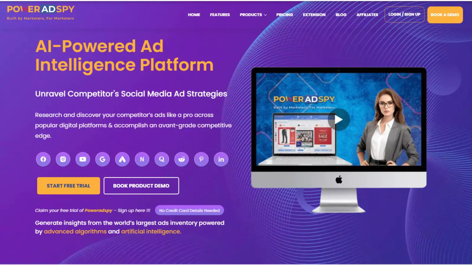
PowerAdSpy is a robust ad intelligence tool that effortlessly uncovers new ad designs and innovative ideas by analyzing your competitors. It lets you monitor competitors in your niche and offers a range of advanced features. Let’s explore them in detail.
Million Ad Library
PowerAdSpy offers a vast and rapidly growing database of ads from over 100 countries. With millions of ads at your fingertips, you can easily find the latest successful designs and strategies in just a few clicks. We add thousands of fresh ads daily.
Image and Video Ads
While images are effective, video ads are currently the top-performing strategy on social media. PowerAdSpy features a growing collection of social video ads, helping you see what resonates with your audience and allowing you to download them for your campaigns.
Filter by Ad Position
Control your research with the ability to filter ads by position, such as News Feed or Side Location. This helps you determine which placements perform best in your niche and drive the highest conversions.
Complete Visibility
Gain clear insights into ad performance with direct access to live ad posts from the platform. You can check real-time engagement and see how audiences are responding.
GEO-Targeted Data
PowerAdSpy’s extensive data center provides precise information on your competitors’ geo-targeting. This helps you identify audiences most interested in your products or services.
Call to Action Insights
Effective calls to action (CTAs) are crucial for successful ad campaigns. PowerAdSpy lets you discover which CTAs are performing best in your niche.
Conclusion
In a world where digital ads are everywhere, making yours stand out is more important than ever. Our guide has shown you how to create ads that truly capture attention- whether through minimalist designs, bold colors, creative typography, or interactive elements. The key takeaway? Great design isn’t just about looking good; it’s about effectively communicating your message and connecting with your audience.
But coming up with fresh, impactful, and creative ad designs can be a challenge. That’s where PowerAdSpy comes in. With its extensive ad library and advanced features, it simplifies the process of discovering successful ad strategies and keeping an eye on your competitors. The next time you’re seeking inspiration or looking to step up your ad game, keep in mind that with the right tools and strategies, you can create innovative ads for your brand that capture attention and deliver results.
FAQs
What is a concept in advertising design?
In advertising design, the concept is the overall plan for your ad. It includes figuring out who your audience is, and what message you want to share, choosing the right platforms to reach people, creating engaging content and visuals, and then checking how well the ad performs.
How to Create an Effective Ad Design
To design an ad that grabs attention, use a free tool like Adobe Express. Choose colors that complement each other, add your brand’s logo, and pick a font that’s easy to read. Ensure to highlight your product’s unique qualities and include a clear call to action.
What are the four essential elements of advertising?
The four essential elements of advertising are:
- Target Audience: Identifying who you want to reach.
- Message: Crafting the core idea you want to communicate.
- Medium: Choosing the right channels to deliver your message.
- Call-to-Action: Encouraging your audience to take the desired action.
These elements ensure your message reaches the right people, through the most effective channels, and prompts them to act.
What additional elements can enhance an advertising strategy?
In addition to the core four, here are four more elements to enhance your advertising strategy:
- Creativity: Making your ad stand out.
- Consistency: Maintaining a uniform message across all platforms.
- Timing: Delivering your message at the right moment.
- Budget: Allocating resources effectively to maximize impact.
Understanding and integrating these elements can significantly boost the effectiveness of your advertising campaigns.

