Luxury Brand Color Palette: Elevate Your Brand’s Presence –
Luxury is all about the details, isn’t it? Whether it’s the feel of a high-quality fabric or the ambiance of a boutique, every little thing contributes to the overall experience. But have you ever stopped to think about how significant color is in all of this?
That’s what we’re here to explore in this blog. We’re diving deep into the world of luxury branding and how choosing the right colors can make all the difference. Think of it as painting a picture of your brand’s identity – the colors you choose can convey sophistication, exclusivity, and so much more.
We’ll take a look at how some of the most iconic luxury brands use color to tell their story and captivate their audience. Whether you’re a seasoned marketer or just starting your luxury brand journey, understanding color psychology in marketing can help you make a lasting impression.
So, join us as we unravel the mysteries of luxury brand color palettes and learn how to make your brand stand out in a sea of competitors.
Listen To The Podcast Now!
Understanding Luxury Brand Color Palette:
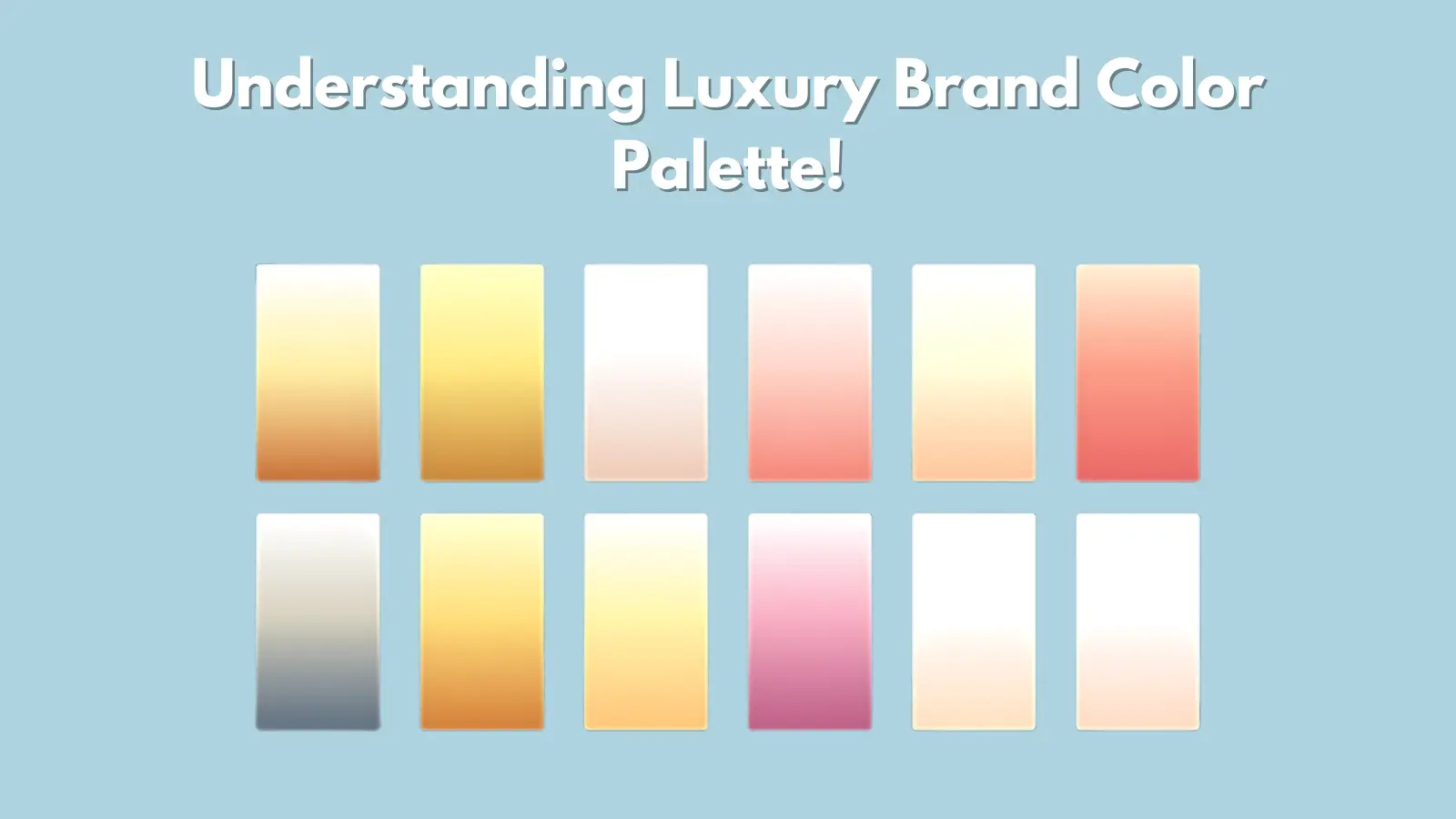
A luxury brand’s color palette is more than just a selection of hues; it’s a strategic choice that reflects the brand’s identity, values, and aspirations. Unlike mainstream brands, luxury brands aim to evoke a sense of prestige, sophistication, and exclusivity, and their color palette plays a pivotal role in achieving this objective.
The term “luxury” is often associated with specific colors such as deep blacks, rich golds, elegant silvers, and regal purples. These colors evoke luxury, refinement, and a sense of timeless elegance. The luxury brand color palette transcends stereotypes, thoughtfully curated to convey a unique and distinct message to its audience.
The Importance of a Thoughtful Color Palette:
In luxury branding, the color palette is not just a visual choice but a powerful tool that communicates a brand’s identity, values, and promise to its audience. A thoughtfully curated luxury brand color palette can set a luxury brand apart from the competition, creating an emotional connection with consumers and enhancing the brand’s perceived value. Here are some reasons why a meticulous approach to color selection is crucial:
- Conveying Brand Identity and Values:
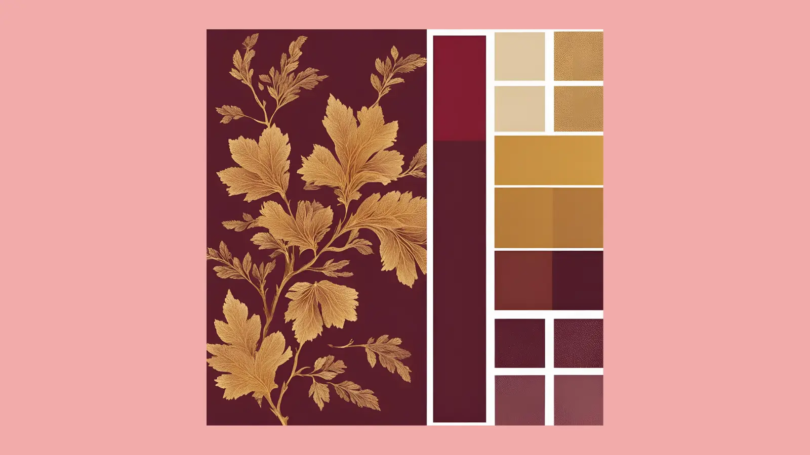
Colors quickly communicate a brand’s identity and core values. For instance, rich burgundy and gold might signal heritage, while sleek black and white suggest modernity.
- Evoking Emotional Responses:
Different colors elicit various emotions. Luxury brands choose colors that evoke sophistication, exclusivity, and desire, influencing consumer perceptions and decisions.
- Enhancing Brand Recognition:
Consistent use of specific colors across all brand touchpoints builds strong brand recognition, making the brand more memorable and identifiable in a crowded market.
- Supporting Brand Messaging and Storytelling:
Each color can represent different aspects of your brand story, enhancing your narrative and creating a richer, more immersive experience.
- Influencing Perceived Quality and Value:
Using luxurious colors such as deep blacks, rich golds, and elegant silvers can enhance the perceived quality and value, thus increasing the desirability of products.
- Adapting to Market Trends and Preferences:
A thoughtful color palette allows for flexibility, enabling you to update your colors to reflect current trends while maintaining consistency.
A well-chosen luxury brand color palette is essential for luxury brands to convey their identity, evoke emotions, enhance recognition, and adapt to trends, ensuring a lasting connection with their audience.
The Psychology of Color in Marketing:
Color psychology is a fascinating realm that explores the intricate relationship between colors and human emotions, perceptions, and behaviors, especially crucial when considering colors for branding. In effective advertising, grasping this psychology can determine whether you seize attention or vanish unnoticed. For luxury brands, whose very existence hinges on eliciting feelings of desire, prestige, and aspiration, mastering this art is imperative. Let’s embark on a journey through the spectrum:
Black: Black, epitomizing sophistication and mystery, demands attention and radiates luxury and exclusivity. It’s a timeless choice for brands seeking to evoke a sense of elegance and allure.
Gold: Symbolic of wealth, prosperity, and grandeur, gold is synonymous with luxury and extravagance. Its captivating shimmer appeals to the senses, making it a sought-after choice for luxury brands in various industries.
White: The embodiment of purity, simplicity, and refinement, white conveys a sense of understated elegance and sophistication. It acts as a blank canvas, letting other elements shine while emitting a timeless charm.
Red: Bold, passionate, and attention-grabbing, red ignites the senses and evokes feelings of desire, excitement, and power. Luxury brands often use it to instill a sense of urgency and provoke a visceral response from the audience.
Blue: Serene implies trust and calmness, while blue suggests confidence and reliability. Its versatility allows it to seamlessly blend into luxury branding, evoking feelings of trust and integrity.
Implementing Brand Guidelines for Consistency
Establishing and adhering to comprehensive brand guidelines color palette is crucial to maintaining a consistent and impactful brand presence. These guidelines should specify the particular shades, combinations, and rules for using your brand colors.
Here’s how to effectively implement the brand guidelines for your color palette:
Create a Brand Guidelines Document: Develop a detailed brand guidelines document that outlines the exact colors in your luxury brand color palette, including hex codes, RGB values, and CMYK equivalents. Provide clear instructions on using these colors in different contexts, such as logos, backgrounds, text, and accents.
Train Your Team: Ensure that everyone involved in your brand’s visual communication, from designers to marketers, is well-versed in your brand guidelines. Conduct training sessions and provide resources to help your team understand and implement the guidelines effectively.
Monitor Consistency: Regularly review your brand’s visual materials to ensure adherence to the color guidelines. Use tools like digital asset management (DAM) systems to centralize and manage all brand assets, making it easier to maintain consistency across all touchpoints.
Adapt and Evolve: While consistency is crucial, it’s also important to remain adaptable. Periodically review and update your brand guidelines to reflect changes in the market, evolving brand strategies, and feedback from your audience. Ensure that any updates are communicated clearly to your team.
Crafting Your Brand’s Color Palette with Precision –
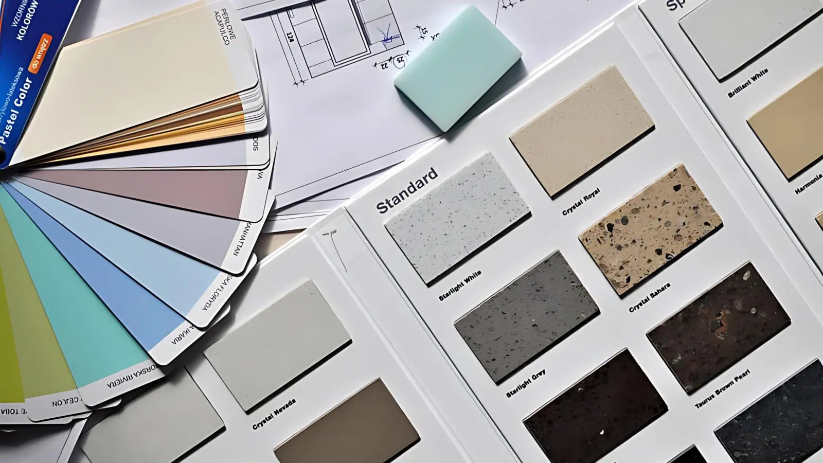
Creating a compelling luxury brand color palette requires a delicate balance of art and science. Here are some essential tips to guide you on this transformative journey for advertising your business:
Establishing Brand Identity:
Before delving into color selection, it’s crucial to have a clear understanding of your brand’s identity. Ask yourself vital questions: What values and principles does your brand stand for? What personality characteristics would you like your brand to represent? What sets your brand apart in the crowded luxury market? Your brand identity establishes the foundation for constructing your luxury brand color palette.
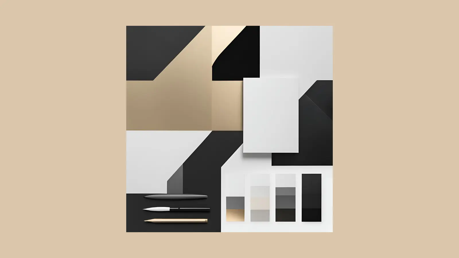
For example – if your brand exudes modernity and minimalism, a sleek combination of black, white, and metallic tones might be appropriate.
On the other hand, if your brand is rooted in tradition and heritage, intense, richer shades like burgundy and gold may be more fitting.
Embrace Color Psychology:
Plunge into the depths of color psychology and explore the emotions and associations linked with each hue. Choose colors that align with your brand’s messaging and resonate with your target audience on a visceral level.
Seek Inspiration:
Draw inspiration from various sources to create a unique and compelling luxury brand color palette. Look at industry leaders and competitors to understand current trends and standards. Analyze their color choices and how they resonate with their target audience.
Additionally, explore other fields such as fashion, art, architecture, and nature.
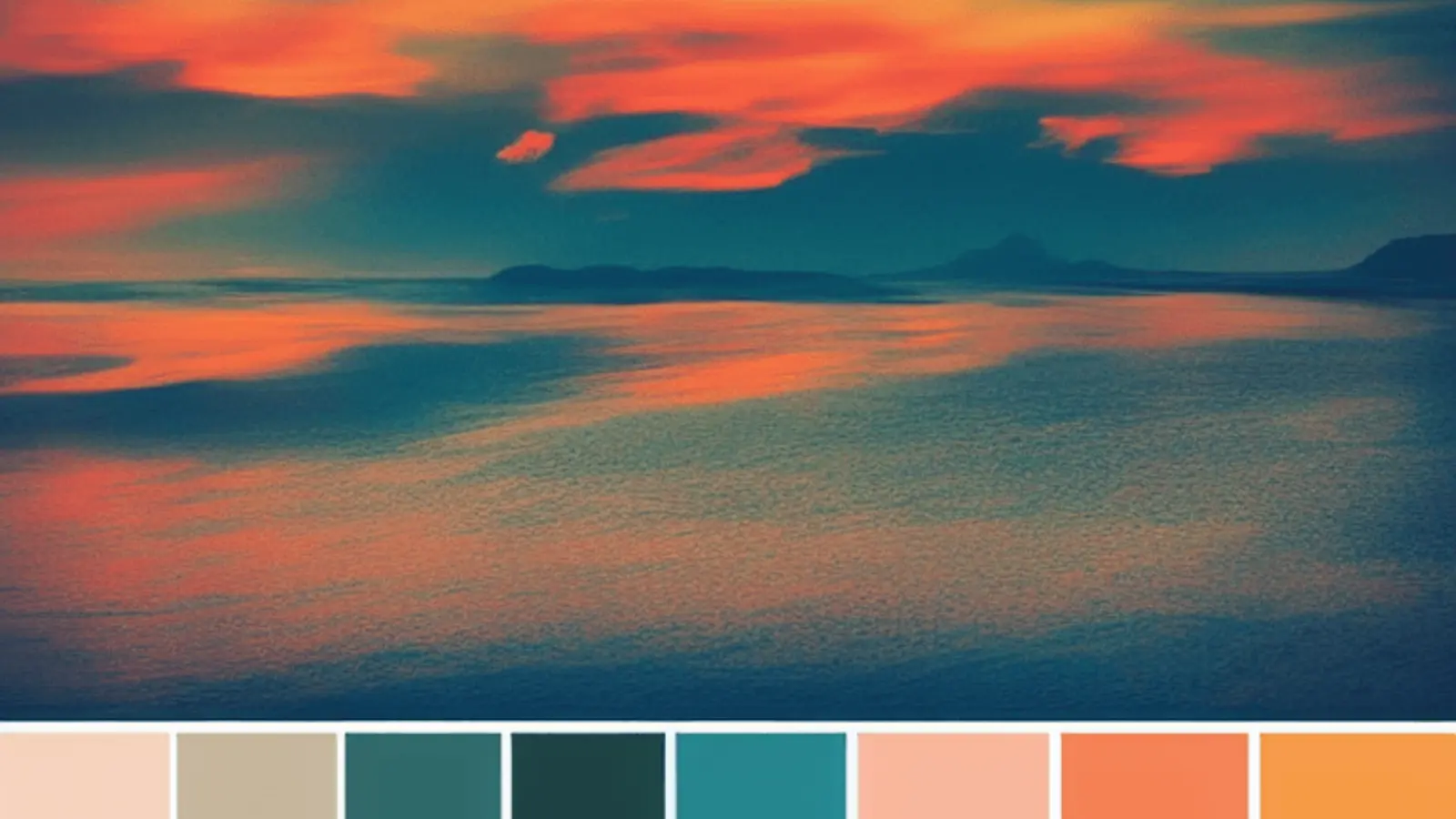
For instance, the vibrant colors of a sunset, the detailed patterns in artwork, or the sleek lines of a contemporary building can all inspire your palette.
Maintain Consistency:
Consistency is crucial to building a firm brand identity. Consistently applying your chosen luxury brand color palette across all brand touchpoints is vital. It includes your logo, website, social media profiles, packaging, marketing materials, and even the interior design of your physical stores, if applicable. Consistent use of color helps reinforce brand recognition and creates a cohesive visual identity that your audience can effortlessly identify and connect with.
Leverage Technology:
In today’s digital age, numerous tools and resources are available to streamline color selection. From color palette generators to brand management platforms, harness the power of technology to bring your vision to life.
To gauge how competitors leverage color to their brand advantage, consider using an ad intelligence tool such as PowerAdSpy. You can analyze competitors’ ad creatives to gain insights into their color schemes, design elements, and overall visual strategies.
Study successful luxury brands in your industry to gain insights into effective color combinations and adjust your strategy.
PowerAdSpy – The Best Competitive Intelligence Tool
PowerAdSpy, a robust ad intelligence software, can enhance your capacity to craft a luxury brand color palette by providing insights into effective advertising strategies and visual elements that leading brands use. Here’s how it can help:
Competitive Analysis:
PowerAdSpy allows you to spy on your competitors’ ads. By analyzing the color palettes used in their most successful ads, you can identify trends and patterns that resonate with your target audience. This insight can guide you to choose colors aligned with market preferences.
Trend Identification:
The tool can help you keep track of emerging trends in luxury branding. By observing the evolution of color schemes in popular ads over time, you can stay ahead of the curve and incorporate contemporary yet timeless colors into your palette.
Audience Insights:
PowerAdSpy provides data on the demographics and psychographics of the audience interacting with specific ads. Understanding which luxury brand color palettes attract different segments of your target audience can help you tailor your brand’s visual identity to better connect with your ideal customers.
Engagement Metrics:
You can analyze the performance metrics of ads featuring various color schemes. This data can inform you about which colors generate higher engagement rates, allowing you to optimize your color palette for maximum impact.
Geographic Preferences:
Different colors may have varying levels of appeal in various regions. PowerAdSpy can help you determine geographic preferences, enabling you to customize your color palette to suit regional tastes and cultural significance, which is crucial for a global luxury brand.
Ad Creative Inspiration:
By viewing a wide range of ad creatives, you can gather inspiration for your color schemes. Seeing how successful brands integrate colors into their overall ad design can provide ideas for creating a cohesive and attractive luxury brand color palette.
A/B Testing Insights:
You can study A/B testing results from other brands to understand how different color palettes perform under similar conditions. Save time and resources by using proven strategies instead of starting from the beginning.
By systematically using PowerAdSpy to analyze and derive insights from competitors’ ads, you can create a sophisticated and effective color palette that elevates your luxury brand’s presence in the market.
Also Read: –
10 Best Strategies For Effective Advertising- The Game Changer
How To Advertise Your Business: 09 Best Practices For Thanksgiving and BFCM
Conclusion:
The influence of luxury colors on branding is incredibly significant. A meticulously curated luxury brand color palette does more than enhance visual appeal; it encapsulates the essence of your brand, conveying sophistication, exclusivity, and timeless elegance.
By understanding the psychology of color and implementing consistent brand guidelines, you can create a distinctive identity that resonates deeply with your audience. Tools like PowerAdSpy offer invaluable insights into competitive strategies and market trends, enabling you to craft a compelling color palette tailored to your target demographic.
Embrace the art and science of color to elevate your brand’s presence and ensure it stands out in a competitive landscape. It will help you capture attention and forge a lasting connection with your audience, solidifying your brand’s position as a luxury leader.
FAQs:
- Why is color important in luxury branding?
Color is crucial in luxury branding to convey sophistication and exclusivity. The right color palette can evoke specific emotions and perceptions, making a lasting impression on your audience.
- How does color psychology influence luxury branding?
Color psychology explores the relationship between colors and human emotions, perceptions, and behaviors. For luxury brands, it is essential to understand this psychology to evoke feelings of desire, prestige, and aspiration. Each color has specific associations that can influence consumer behavior and brand perception.
- How does consistency in color reinforce brand recognition?
Consistent use of color across all brand touchpoints helps reinforce brand recognition and creates a cohesive visual identity. This consistency makes it easier for audience to identify and connect with your brand, strengthening its presence in the market.
- How often should a luxury brand update its color palette?
Staying current is important, but frequent changes to a luxury brand’s colors can confuse customers and weaken recognition. Make updates thoughtfully and sparingly, ensuring they enhance the brand’s identity rather than disrupt it.

