6 Facebook Ecommerce Ads Examples To Boost Your Sales
Do you want your ad to stand out? Then stick to this article where we will research and find out the features of successful ad campaigns through Facebook ecommerce ads examples.
As of today, in 2023, more than two billion people have digitally purchased various goods, and that number is increasing day by day. It means an enormous ecommerce advertising competition!
Those who truly understand the market know that the ecommerce industry is stretching its boundaries at an electronic speed. Digital giants like Facebook and Instagram have introduced shopping features and are trying to commence monetization of almost everything for their users.
Two factors have accelerated the boost of online sales; the first is the contactless purchase trend, and the second is compelling ecommerce advertisements.
While people are starting to notice the bigfoot of the e-commerce industry, a few things are still not out in the light. So, let us begin this discussion with a fair question; What are ecommerce ads examples?
In a hurry? Listen to the blog instead!
What Are Ecommerce Ads?
Ecommerce ads solely refer to the display of advertisements through online or offline media for generating sales and brand recognition. Nowadays, digital media is the most preferred choice of markets and vendors because it is economically feasible and has a higher reach prospect.
Several platforms present are on the digital plane that provides visibility and engagement to ecommerce ads. Such as social media sites, mailer platforms, push messages, landing pages, mobile applications of those landing pages, and RSS feeds.
While television ads also play a crucial role in generating engagement and sales. Ecommerce ads examples concern all the products that are essential for livelihood. For example, beauty products, home appliances, best-selling equipment, electronics, wearable products, fashion clothing, accessories, medicine, books, furniture, and groceries.
Talking about digital media, Facebook is the leading platform for ecommerce advertising. Ultimately every ecommerce channel and page present on Facebook serves as the milestone of the lead bank for any merchant.
Well, up to now, we have perfectly established the grip over the concept of ecommerce ads examples. Now, let us move ahead and decode the recipe of a successful sales campaign through well-planned ecommerce Facebook ads.
Understand The Structure Of 6 Powerful Ecommerce Ads Examples
When it comes to ecommerce ads, some approaches manifest your lead generation and sales effectively. A powerful ad is a combination of these techniques. However, you should note these ecommerce advertising strategies to apply to visual ads.
So let us discuss these techniques.
Compelling Visual.
Human psychology tends to respond more likely when exposed to colorful and compelling visuals. That could be anything! There are color psychologies used in the ads in a way that they could influence human minds psychologically.
Plus, it is mandatory to have top-notch quality in their visual ads. The ad will resonate with the visitors or audience when you put out a unique vibe through the ad. And that will be ensured by the compelling visuals of your ecommerce ads.
Appropriate Call-To-Action.
Call-to-action buttons are the most crucial element of any ecommerce advertising strategy present on the plane. Generally, beginner copywriters tend to overload the CTA on the advert copy. And that is one mistake you should avoid. CTA on the advert should always be short, clear, catchy, and precise.
The placement of CTA on imagery ecommerce ads should be on the lower part of the ad creative because you would first likely inform your buyer about the product. Then the unique tell of your brand before introducing the CTA to them.
However, there are no such rulebooks for CTA placements. However, it is expected to generate more impact when you follow a psychological order of knowledge and action. Many real-life ecommerce ads examples prioritize the psychology of their target audience to place CTA buttons on their ads.
Compelling Copy.
Ad copy is the glue that binds its customer to the product. Generally, imagery ads do not always require an ad copy. Sometimes compelling visuals and one CTA button are enough to generate sales. But in video ads, you have to have a sales copy and CTA copy.
- Sales Copy:
Sales copy is the part of the ad copy that informs its customer about the latest deal on the product. They act as the foundation for trust-building so that you ask them to take their interest in the product to the next level.
- CTA Copy:
CTA copy is the element of the ad where you ask them to buy the product. They always seem cheerful, fun, hopeful (when your sales copy is about stress and fear), and sometimes sarcastic or neutral.
Since you want people to buy your product, you need to give them enough reasons why your brand and product are reasonable. Therefore, a compelling ecommerce ad copy is all you need to make that happen. Make sure to have not more than seven to ten words in the imagery ad copy.
Celebrities And Models
Your brand is the face of your product. But to represent your brand, a human face is the most relatable choice you can make. Mainly, successful brands go for celebrities to establish face value among their audience. But the newcomers and small brands can opt for models to represent their brand and ultimately generate sales. You can notice that the smart ecommerce ads examples have celebs in them.
Presence Of Objects Relevant To Ads.
You want your ecommerce ads to be creative yet easy to understand. Thus, you would keep a minimum of objects that relate to the product you are advertising. For example, if your product is a camera, you would like to present the camera as the main object in your ad.
However, if you have a larger frame, include objects that relate to the product and its purpose.
Empty Spaces In Ads.
It is the most crucial element of your ad that you do not want to miss. Have you noticed? When you do your home interior decoration, you do not like to place everything you need in a single place! You prefer to scatter them a bit, make spaces for other things, and keep things in the relevant area.
Well, this idea and approach are the same while planning ecommerce ads examples and creatives. You do not want to bulk them with information. People usually do not have time to zoom in to see what else is there. If they find it messy, they won’t even bother looking at it.
So make sure to keep your idea clear. Speak more in less!
Service/Product Previews.
Giving product previews helps your audience to understand the type of product you are promoting. Also, it establishes a firm ground of product information so that the audience can easily respond to the CTA.
Appropriate sentiment In Ads.
If you are an experienced merchant, you will know that your buyer will most likely buy things only under two conditions—out of sentiment or out of need. So, why not let your sales copy pitch the right sentiment that resonates with your product?
For example, you are promoting cups. There are several types of cups present in the market, but you need to convince your customer to buy a specific kind of cup that you are offering. That is where sentiment plays its role! Your cup will stand out when you give your audience a reason and an occasion to use it. Let’s suppose your cups are designed specifically for elite meetings, evening tea, or warm family gatherings.
Want inspiration? You can find more amazing ways to pour sentiments into your ads by checking out the best ecommerce Facebook ads online. Also, exploring Facebook ad examples 2023 will show you how successful brands have tapped into emotions to drive conversions and engagement. These examples can guide you in crafting a message that not only sells but also connects.
FOMO (Fear of missing out).
People like to get things that most people do not have. Usually, it is a merchant who competes with other merchants to get desired sales. Well, FOMO raises the level of competition among your buyers to have the product.
You can put a limited edition offer on your product. Or can tell your customers that only a certain quantity is available so they can book their spot.
Exclusive Offers.
According to the buyer’s psychology, offers seem like the best deal. Because now, they are saving a lot of money on usual products. You need to create such a buzz if you want great sales. You can also leverage festivals or other sentimental events to set out an offer. In case you notice, there are many ecommerce ads examples out there that focus on certain festivals or events.
Best Ecommerce Ads Examples| Plan Before You Proceed
So, you are all worked up with all these details of ecommerce Facebook ad examples. Let us move on to the platforms where these ads generally perform so well.
We all know that Facebook is a popular and convenient platform to introduce digital visibility and brand recognition. Well, Facebook is also stretching its boundaries to be an ideal choice for the best e-commerce advertising. Lately, Facebook has introduced shops and marts on the platform and connected many small businesses to the main channels.
Facebook also provides personalization options through interests, locations, connections, friend’s activities, and much more. If you want to start a top-notch e-commerce business, Facebook can be the choice you can opt for.
Well, many brands have grown their list of loyal customers by leveraging Facebook for their product promotion. You can do that too by observing leading ecommerce ads examples running on Facebook.
Are you wondering how to narrow down your searches for e-commerce advertising examples on your chosen platform? Then you can use the ad intelligence software PowerAdSpy. With one of the world’s largest ad databases, supported on more than eight social media platforms and comprehensive search mechanisms, you can examine any leading ad and decode its structure only with a click.
Now, let us examine the six best ecommerce Facebook ad examples to get a better understanding.
Six Hand-Picked Ecommerce Ads Examples
Amazon India Ad.
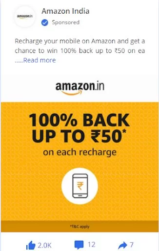
This advert only has sales copy and a relevant CTA, without including much of a great visual. Well, it is the most simple ad, and it still works. The offer copy has a breathing space by leaving side spaces empty and central filled with offers, CTA, and product images.
You can see the CTA is quite simple. That makes it a more general advert whose direct purpose is to pitch the customer. Here, the display image in the center is about the service rather than the product. That is why the image is kept short as compared to the offer copy.
Walmart Ad.
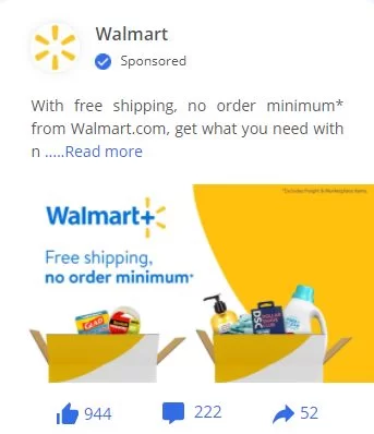
In this ecommerce ads example, no CTA is there, but still, it will generate sales. Do you know why? Because it is an informative ad whose general purpose is to notify people about the current deal. And since its copy is quite intelligent, it does not require a CTA to bring sales on board.
Shopify Yes Custom Ad.
It is the most creative ad we have on the list. Who would have related the fun sentiment with the simple and ordinary pair of socks? Wouldn’t it feel like we want to buy it right now, even if it does not have any sales copy?
The ad is composed of creative and colorful gradients of yellow and orange, which signifies fun and energy. The visual is strong enough to set you in motion towards sales. The offer is precise and clear. You can perceive fun with the placement of the offer on the ecommerce ads example.
Magento Nykaa Fashion Ad.
The ad is composed with the bare minimum elements a creative idea can possibly require. However, the available caption gives information regarding the deal and the product. The caption also has the CTA, which is not present in the ad copy. Here, this ecommerce ads example is composed of a very calculated amount of empty white spaces.
WooCommerce Sabri Subi Ad.
It is the most different ad on our list. The ad is composed of a few newsletters, many smiling faces, and information on the output of their product. The copy is quite intelligent, and it suits the social proof. It displays the output of the product, which makes it more engaging. This visual generates trust among the audience regarding the product.
Read More:
The Power of Facebook Ads For E-commerce Business Growth
13 eCommerce Ads Examples To Create Better Ad Campaigns
Schedule Instagram Posts: Do now, For later!
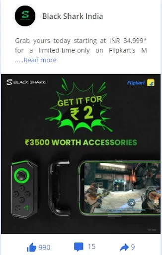
Flipkart Ad.
The ad is composed of a black background with its product and an enlightening powerful caption. You can see the most highlighted product, that is the one they are promoting. Here, the CTA is composed of numerical digits, making it appear like the center of attention in the whole creation.
Conclusion
These were the most creative ecommerce ads examples you can see in your daily life.
If you are brooding about the best ecommerce advertising examples, then the above-discussed points would help you decode their structure and pitch.
Well, there is some software available on the market that decodes your chosen ecommerce ads with a click. For example, with PowerAdSpy, you can get a thorough advert analysis report without putting much effort into deducing every element of ecommerce ads examples to know why they work.
However, there are also other criteria present that confirm the success of an ad, which you could not derive by simply looking at the advert. That is where PowerAdSpy comes in!
So what are you waiting for?

