
The Power Of CTA Button: How To Guide Visitors To Action
Ever clicked on a button that said “Get Started,” “Shop Now,” or “Download Free Guide”? That’s a CTA button, a small but powerful element that can make or break your marketing efforts.
It’s more than just a colorful box with text; it’s your way of saying, “Hey, here’s what to do next!”
Whether you’re running a website, sending emails, or creating social media ads, a clear and compelling CTA button helps guide your audience toward taking action.
It could be signing up for a newsletter, making a purchase, or simply learning more about what you offer. The right CTA doesn’t just sit there; it invites, encourages, and converts.
But what makes a CTA button effective?
Is it the design, the placement, or the words you choose?
In this blog, we’ll explore why CTA buttons matter so much, share real examples that work, and show you how tools like PowerAdSpy can help you learn from the best in the game.
Let’s dive in and unlock the true potential of that little button.
Listen to the Podcast Now:
What Is A CTA Button?

A CTA button, short for Call-To-Action button, is a clickable element designed to prompt users to take a specific action.
Whether it’s “Buy Now,” “Sign Up,” “Download,” or “Learn More,” these buttons act as visual cues that guide visitors toward the next step in their journey.
In digital marketing, a CTA button is often the bridge between user interest and conversion.
You’ll find them on websites, landing pages, email campaigns, and even social media ads, anywhere you want to encourage a user to engage further.
So, what is CTA button in simple terms?
It’s the digital version of a salesperson’s nudge, an invitation to act.
But it’s more than just a button; its success depends on strategic placement, compelling copy, and thoughtful design.
When done right, a CTA button can dramatically increase clicks, boost conversions, and drive results for any business.
Think of it as your marketing message, packed into a single, powerful action prompt.
CTA Button Meaning & Importance In Digital Marketing:

In the fast-paced world of digital marketing, every second counts, and so does every click.
That’s where CTA buttons come into play.
So, now, do you know the CTA meaning in social media campaigns?
CTA stands for “Call-to-Action,” and a CTA button is a clickable element designed to prompt users to take a specific step, such as “Buy Now,” “Subscribe,” or “Learn More.”
It may seem like a small part of a webpage, but the CTA button plays a powerful role in guiding visitors through the customer journey.
Whether you’re generating leads, boosting sales, or encouraging sign-ups, a well-designed CTA can significantly increase your conversion rates.
What makes it important?
It’s the bridge between content and action.
Without a clear CTA, users are more likely to leave your site without taking any meaningful steps.
In short, a CTA button turns passive viewers into active participants, making it a core element of any digital marketing strategy.
Elements Of A High-Converting CTA Button:

A well-crafted CTA button can be the difference between a bounce and a conversion. But what makes a CTA button effective?
Let’s break down the essential elements:
1. Compelling Copy:
Your CTA text should be clear, action-driven, and value-focused. Instead of generic phrases like “Click Here”, use specific language such as “Download the Free Guide” or “Start My Free Trial.”
It informs users of what to expect.
2. Eye-Catching Design:
Your CTA button should stand out without clashing with your brand. Bold colors, rounded edges, and readable fonts work best.
Use contrast to make the button pop from the background, drawing the viewer’s attention naturally.
3. Strategic Placement:
Location matters. Whether it’s above the fold, at the end of a blog post, or as a sticky button, CTAs should appear where user intent is highest. Don’t bury them where no one looks.
4. Mobile Optimization:
Ensure your buttons are thumb-friendly. They should be big enough to tap and be placed logically for smaller screens.
Following these CTA button best practices not only enhances user experience but also increases the likelihood of clicks and conversions.
Test different elements regularly to see what resonates best with your audience.
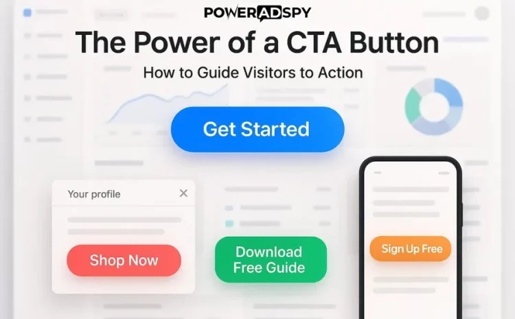
CTA Button Examples That Convert:

Creating a high-converting CTA button goes beyond just slapping a “Click Here” on your page. The best CTA buttons are clear, visually appealing, and directly tied to the user’s intent.
Let’s explore some real-world CTA button examples that are proven to drive clicks and conversions.
1. Netflix – “Join Free for a Month”:
This CTA is effective because it removes friction. The word “Free” grabs attention, and “Join” sounds more inviting than “Sign Up.”
It’s concise, value-driven, and speaks directly to what users want.
2. Dropbox – “Find Your Plan”:
Instead of pushing for an immediate purchase, Dropbox uses this CTA to gently nudge users toward learning more.
It feels personalized and helps guide undecided visitors down the funnel.
3. Shopify – “Start Free Trial”:
It combines urgency and value while reducing commitment anxiety. The phrase tells users they can try before they buy, which boosts conversions.
4. Spotify – “Get Premium”:
Short, clear, and benefit-focused. Users immediately understand what they’re getting.
These CTA button examples work because they balance clarity with persuasion.
Whether you’re designing for a landing page, email, or ad, always tailor your CTA to match your audience’s mindset and goals.
A small tweak in words can make a big impact on your click-through rate.
How Ad Spy Tools Help You Analyze Winning CTA Buttons?

Creating an effective CTA button isn’t just about good design; it’s about understanding what works in real campaigns.
That’s where ad spy tools come into play.
These tools let you peek behind the curtain of top-performing ads across various platforms.
By analyzing what competitors are doing, you can discover trends in CTA button placement, color usage, wording, and overall strategy.
Whether it’s a “Shop Now” on a Facebook ad or a “Download Free Guide” on a landing page, you can see which CTAs are generating the most engagement and conversions.
Ad spy tools help marketers identify winning formulas without wasting time and budget on guesswork.
Instead of starting from scratch, you can filter ads by industry, platform, or call-to-action type and use those insights to improve your campaigns.
It’s competitive intelligence made simple.
PowerAdSpy takes this one step further by offering deep ad analytics across multiple platforms like Facebook, Instagram, YouTube, and more.
With real-time data and filtering options, you can track successful CTA buttons used by industry leaders and use those insights to refine your advertising strategy.
Want to create high-converting CTA buttons faster? PowerAdSpy can show you what’s already working.
Also Read:
10 Powerful Call To Action Examples For Your Business
Master The Art Of Facebook CTA: A Complete Guide
PowerAdSpy: The Ultimate Ad Intelligence Software:

When it comes to crafting the perfect CTA button, guessing just doesn’t cut it anymore.
If you want to know what works, you need to look at real data from real ads, and that’s exactly what PowerAdSpy helps you do.
Think of it as your secret weapon. This powerful ad intelligence software lets you dive into thousands of high-performing ads from platforms like Facebook, Instagram, YouTube, Google, and more.
Want to see what kind of CTA buttons your competitors are using?
Or which ad formats are getting the most engagement in your niche? PowerAdSpy gives you all that insight, and then some.
You can filter ads by industry, call-to-action type, ad position, engagement level, and even country.
This means you’re not just inspired, you’re informed.
You get to learn from successful campaigns and apply those winning tactics to your strategy.
Whether you’re running paid campaigns, building landing pages, or designing social ads, PowerAdSpy helps you stay ahead of the curve. No more trial-and-error. Just smart, data-backed decisions that work.
So if you’re serious about boosting clicks, conversions, and ROI, it’s time to make smarter moves with PowerAdSpy, the ad intelligence software built for modern marketers.
How To Use AdSpy Tools To Improve Your CTA Strategy?

Creating a Powerful Call To Action button doesn’t always mean starting from scratch.
Sometimes, the best ideas come from what’s already working in your industry. That’s where ads spy tools come into play.
These tools allow you to monitor and analyze your competitors’ ad campaigns across platforms like Facebook, Instagram, Google, and more.
By seeing which ads are performing well, you can uncover valuable insights about the types of CTA buttons others are using to grab attention and drive conversions.
Start by searching for ads in your niche using relevant filters, industry, keyword, platform, or engagement rate.
Look closely at the language used in CTA buttons, their placement within the ad, color schemes, and accompanying visuals.
Are they using urgency like “Shop Now” or value-driven phrases like “Get Your Free Trial”?
Once you identify patterns in high-performing CTAs, you can test similar styles or messaging in your campaigns.
The goal isn’t to copy but to adapt proven strategies that resonate with your audience.
In short, ad spy tools give you a competitive edge.
They take the guesswork out of your CTA button strategy by showing you what’s already delivering results, so you can focus on improving, not just experimenting.
Bonus Tips: A/B Testing Your CTA Button:

Creating a CTA button is one thing; optimizing it for clicks is another.
That’s where A/B testing comes in. It allows you to compare two versions of your CTA button to see which one performs better.
Even small changes, like tweaking the color or rephrasing the text, can lead to big improvements in click-through rates.
Start by testing one element at a time. For instance, if your original CTA says “Learn More,” try testing it against “Get Started” or “Try It Free.”
You can also experiment with colors; red might stand out more, but green could feel more trustworthy. Placement matters too.
Test whether your CTA performs better at the top, middle, or bottom of your page.
Don’t forget to give your test enough time to collect meaningful data. A rushed test may give you misleading results.
Use tools like Google Optimize, HubSpot, or Optimizely to run A/B tests without affecting your site’s user experience.
The goal isn’t just to get clicks, it’s to guide visitors toward meaningful actions.
By continuously A/B testing your CTA button, you can fine-tune it for maximum engagement and conversion.
Remember: In digital marketing, small tweaks can lead to big wins. Keep testing, keep optimizing.
FAQ’s:
Q1. What is a CTA button in marketing?
A CTA button, or Call-To-Action button, is a clickable element on a webpage or ad that prompts users to take a specific action, like “Sign Up,” “Buy Now,” or “Learn More.”
It helps guide visitors toward your conversion goals.
Q2. What is the real meaning of a CTA button?
The CTA button goes beyond just being a design element.
It’s a direct invitation to engage with your brand. A strong CTA can improve click-through rates, drive sales, or capture leads by encouraging immediate action.
Q3. How long should a CTA button be?
Keep it short and clear, typically 2 to 5 words. Use action verbs like “Get Started” or “Try Free” to create urgency and clarity.
Q4. Can I use multiple CTA buttons on one page?
Yes, but use them strategically. If the page has different sections or user goals, placing more than one CTA is fine, just make sure they don’t compete with each other.
Q5. Should I A/B test my CTA buttons?
Absolutely. Testing different colors, copy, and placements can significantly boost performance. Even small tweaks can lead to higher conversions over time.
Conclusion:
At the end of the day, your CTA button is like a gentle nudge, helping your visitors take that next step, whether it’s signing up, making a purchase, or just learning more.
It might seem like a small detail, but when done right, it can make a big difference in how people interact with your content.
We’ve walked through what makes a CTA work, from smart wording to where you place it, and how you can learn from others using tools like PowerAdSpy.
Why guess what works when you can see what’s already getting clicks?
So if you want more engagement, better results, and fewer missed opportunities, start by giving your CTA buttons the attention they deserve.
Need inspiration?
Let PowerAdSpy show you the top-performing CTAs in your industry.